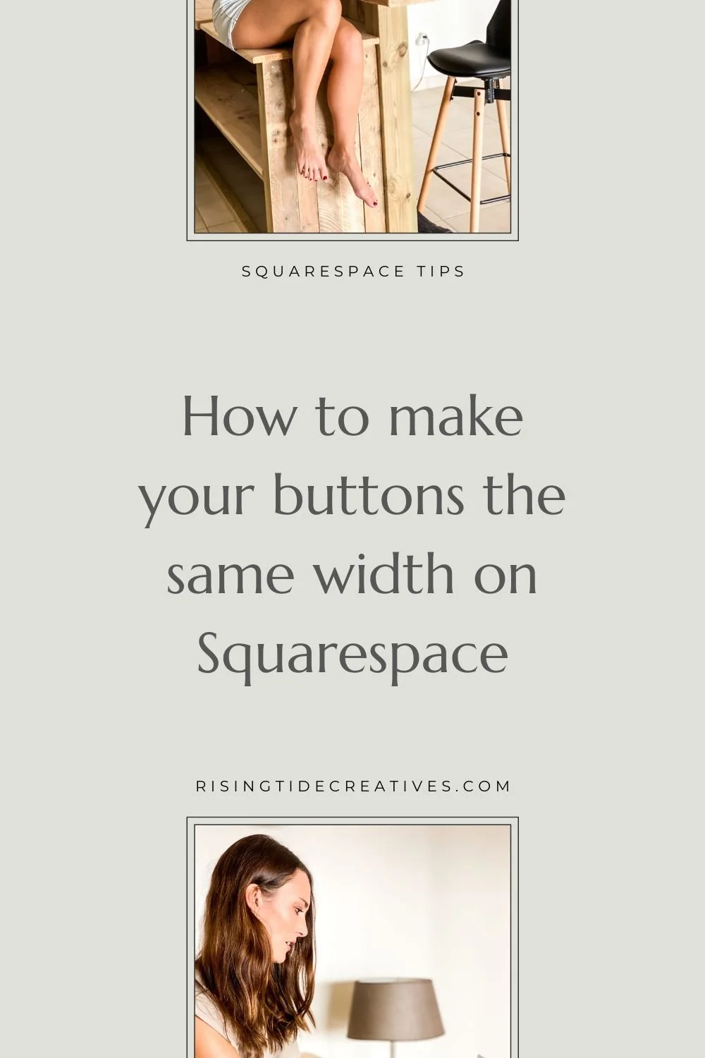
How to make buttons the same width on Squarespace
Squarespace automatically sizes buttons to the length of text that is inside them.
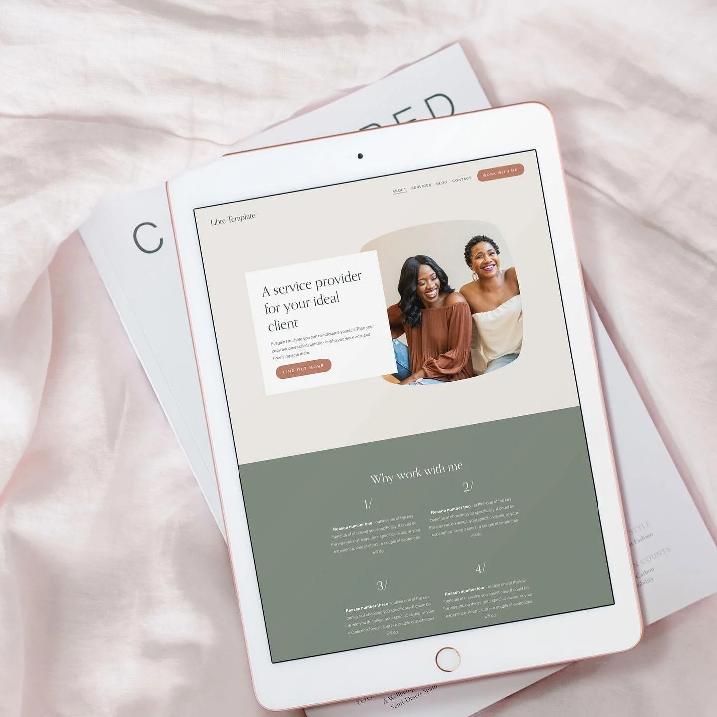
Normally this is fine, as it looks well balanced with the button text.
However on mobile devices, or in a section where we have multiple buttons stacked or close together like on a “linktree” page it can look a little messy for them to all be different widths.
This code snippet which walks you through how to make buttons the same width on Squarespace will make your buttons the same size to tidy up your design and make your site look that little bit more slick n professional!
Add this CSS snippet to the CSS panel in the design section of your site.
CSS to make buttons the same width on Squarespace 7.1 Classic Editor
///BUTTONS SAME WIDTH///

.sqs-block-button-element {width: 200px}
If you would like to apply the CSS snippet to only one button or section you can apply it to the block ID of that block, or section ID of that section only.
CSS to make buttons the same width in one block or section
///BUTTONS SAME WIDTH SECTION X ONLY///

#block-id {.sqs-block-button-element {width: 200px}}
Customise button width
You can customise the 200px width to whatever you’d like. Be mindful though - it’s also an absolute size so it won’t change based on the size of the screen meaning on some screens it will appear larger than on others. To have a size of button that is relative to the screen size (e.g. a % of the screen width) you can use a % value - this is especially good on mobiles. Again you can choose what percentage you’d like. I tend to go for 70%.
The CSS then becomes:
{.sqs-block-button-element {width: 70% !important}}
Then if you’d like this to only apply to mobiles we use this media query in front.
@media only screen and (max-width:767px)
And to change the width of buttons just on desktop you can add this in front. (Make sure to then wrap the rest of your snippet in curly brackets).
So if you’d like to have an absolute value for your button widths on desktop and a percentage value for your button widths on mobile you can bring it all together to look like this. Don’t forget to replace the section ids with your own.
Need help finding section IDs for your Squarespace site - use my favorite ID finder chrome extension by Heather Tovey (Free btw!) & it becomes & breeze!!
///BUTTON WIDTH MOBILE///

@media only screen and (max-width:767px) {
	#section-ID{
	.sqs-block-button-element {
	width: 70% !important
}
}
}

///BUTTON WIDTH DESKTOP///

@media only screen and (min-width:767px) {
	#section-id{
	.sqs-block-button-element {
	width: 200px !important
}
}
}
Less of a DIYer and want someone to do it for you?
You can grab a power hour with me to solve some of your Squarespace niggles…


New on the ‘Gram…