Contact Page Design - Inspiration, Ideas & Tips!

Your Contact Page is one of the most important pages on your website, but all too often it tends to be the place where people run out of steam & just chuck a form on a page without any more thought.
Thing is, your Contact Page Design can be the difference between an inbox full of enquiries, a fully booked restaurant or sold out store and… well crickets.
So let’s unpick what makes a good contact page, the pitfalls to avoid, some fabulous examples and a free contact page template to help you create a contact page design fitting of your biz!
This post may contain affiliate links. These are denoted by a *. If you make a purchase via one of these links I may get a small kickback. I only recommend products and services I use and love myself! Thanks in advance :)
What makes a Good Contact Page?
I’m glad you asked!
Like any page on our site, with our Contact Page we should start by thinking about who’s arriving on the page and what we want them to do.
Generally speaking the people arriving on your contact page are either warm leads (people interested in working with you/ eating at your restaurant etc) and needing some form of additional information - this could be prices, location, how to take the step to work with you etc.
The other profile of person that’s arriving on your contact page is an existing client who needs to get in touch for some reason - that could be because they’re having an issue or challenge and need customer service support, or because they want to buy from you again.
A good contact page meets the needs of the visitors to that page whilst also allowing your business to service those needs as efficiently as possible for you.
How do I Create a Contact Page
So step one… when designing your website’s contact page is to put yourself in the shoes of your visitors and note down what information they’ll need.
Step two is to think about any systems or processes that’ll make your life easier! This could be including an FAQs section if you want to reduce the amount of email with questions you’re having to respond to, or it could be triaging customer support issues.
Step three is to then think about how to lay out this information and functionality in a beautiful way (the examples and inspo below will help you with this!!)
And finally, log on into your website building software of choice (I’m a Squarespace fan - here’s why!), create a new page and build it out!
Contact Us Page Tips & Ideas!
make it easy to find
Don’t hide your contact page! It’s a hub of warm leads - so make it easy peasy to find & use!
Be human
Your contact us page is the equivalent of your welcome desk in a physical location - and we all know that dealing with humans makes things easier and oh so more enjoyable! So be human in your copy - use casual and friendly language and help people feel connected to you.
If you can use photo of a human (bonus points if it’s you or one of your team!) and you share their name - this helps people feel connected to them.
Funny, joyful or sweet contact pages make it more likely you’ll stick in your audience’s head!
Set expectations
Be clear with what people can expect from you - how soon you’ll respond, if there are things you won’t respond to etc. Ever submitted a form on a site & then wondered if it even got there?! If you know you’ll hear back within 48 hours you’re not sitting there wondering!
keep forms short
Where possible keep your forms short (longer enquiry forms reduce conversions!) whilst getting the key info you need!
brand consistency
Keep your contact page on brand - what do I mean by this? Use the same color-palette, brand voice, photo style etc as the rest of your website & brand is really important to make your contact page feel consistent & integrated.
Make it easy to contact you
The primary purpose of most contact pages is to have people contact you! And so we wanna make this as easy as possible. Think different options, email, a form, phone. Share your physical location if you have one - and bonus points for making it obvious by using a map (on Squarespace this is as simple as adding a map block), share your opening hours (and keep these up to date!
Finally let them know when they'll hear back from you! Don’t keep your people hanging!
Make your own life easy
Smart web design gives a fabulous experience to your visitors, whilst automating & making your life as easy as possible! Put differently, a good website shouldn’t create more work for you!
So on your contact page, think about channelling enquiries to the right person or email address, provide information to commonly asked questions, set up automations to manage enquiries or handle call bookings, let people book their dinner online - think about what will make your life easy & do it as much as possible!
Contact Page Design Examples & Inspiration
One of the best ways to create a killah contact page is to check out contact pages from other businesses to get ideas! So here are some of my faves - combine these with the tips above & of course my contact page template and you’ll be on your way in no time!!
Contact Page design Example: Simple & Effective
Website: Unbounce
Designer: NK
What I love about this contact page design example
Now you might look at this contact page and think it’s pretty unexciting, but this vanilla veneer shouldn’t take away from the smart way this contact page is set up. Unbounce is clear about the different reasons that people would want to be in touch with them and channels these, making it super simple & easy for people to know where to click & what to do.
They’ve also clearly laid out their locations & phone numbers in case people need to get in touch directly.
Not super jazzy, but you can tell that their processes are solid!

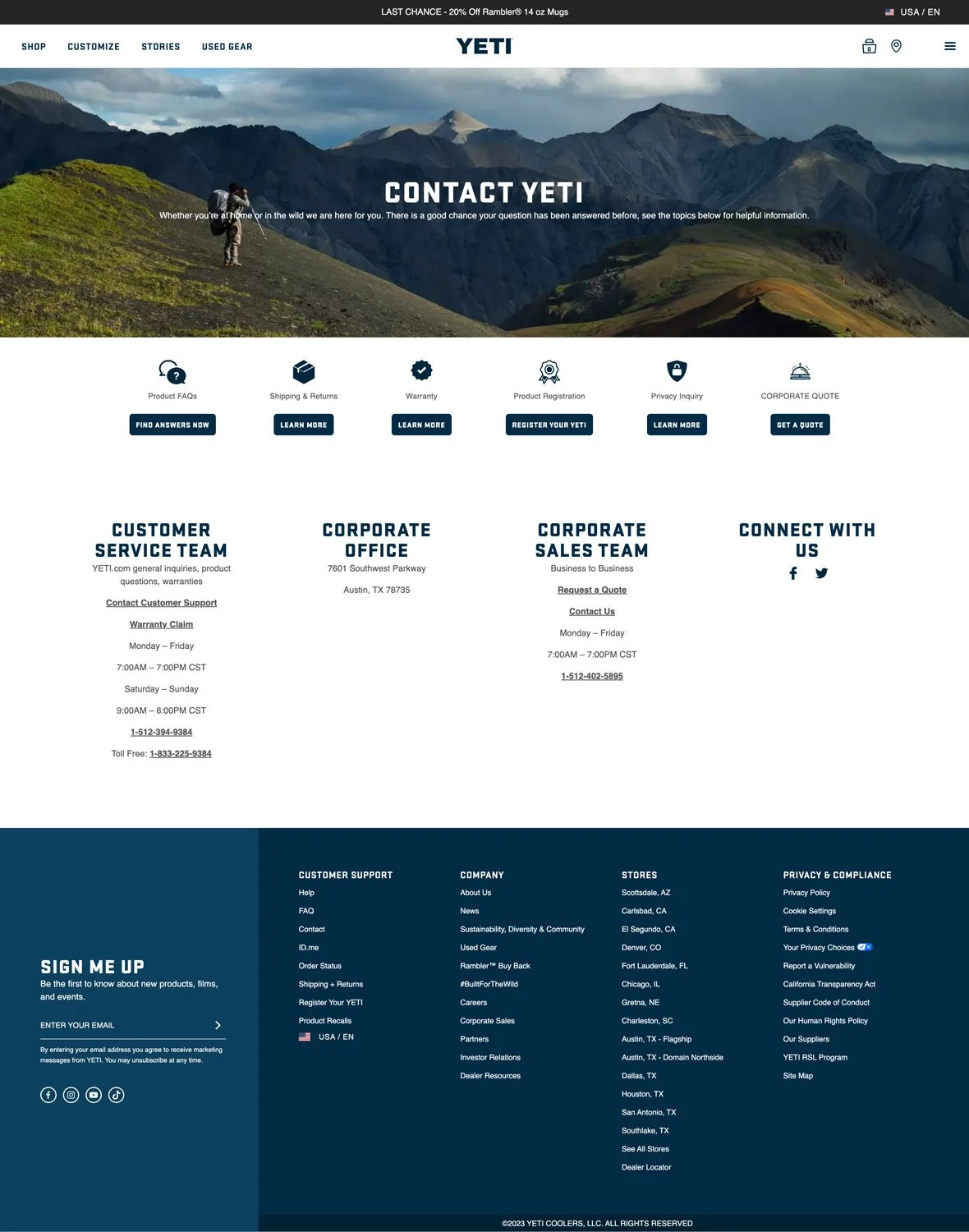
Contact Page Example: Organised & On-Brand
Website: Yeti
Designer: NK
What I love about this contact page design example
Yeti manages to offer a super organised page that helps people opt into what they need from the contact page, whilst also using an image and copy that makes it feel super onbrand.
You’ll see they also mention that they’re responding to common questions in the information they provided, but at the same time they don’t hide the details needed to just give ‘em a call (one of my pet peeves!)
They’ve also added a way to connect with them on social media - another great thing to have on your contact page!
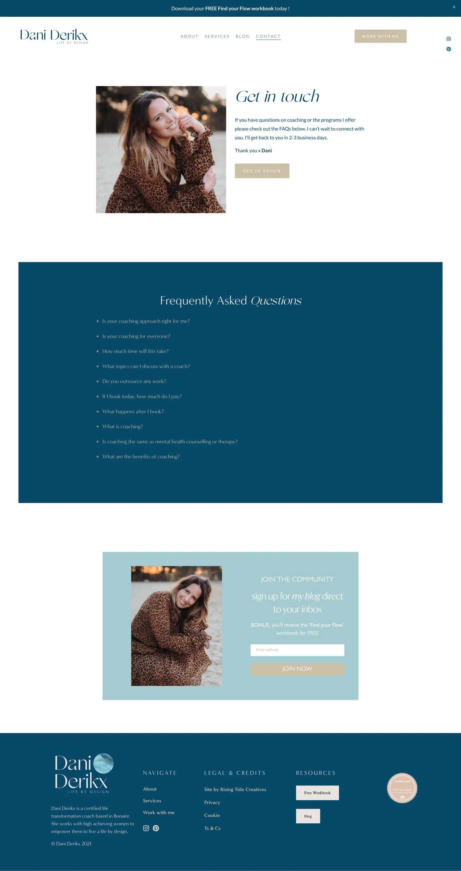
Contact Page Example: Human Connection & Design
Website: Dani Derikx
Designer: Rising Tide Creatives
What I love about this contact page example
Dani’s Contact Us Page uses a great pic of her looking toward the camera to give a good sense of human connection, plus some brief but on-brand copy setting clear expectations. The form is a pop-out that appears when people click the get in touch button which keeps the design clean & paired back.
Dani’s also included a set of FAQs that also help people figure out whether coaching is right for them amongst other topics - Dani’s been smart here by pre-empting people’s reservations and issues allowing them to be addressed before she even gets on a call with a prospective client!
The final thing I love on Dani’s contact page design is that she’s included an opt in gift her free “Find your Flow” workbook, a great pre-cursor to working with her!
Contact Page Example: Clear Options & Expectations
Website: Therapy for Black Girls
Designer: NK
What I love about this contact page design example
Once again, the clear options & expectations are what makes this contact page design stand out. The fact they use different email addresses for the different options also shows that you don’t need contact forms & can keep things mega simple.
They’re also super clear about not sharing private information and where to get urgent help if needed, and given their sector shows they really understand their audience.

Contact Page design Example: Sweet & Full Of Character!
Website: Deux Huit Huit
Designer: Deux Huit Huit
What I love about this contact page design example
I LOVE this contact page design from Design studio Deux Huit Huit. It hits alll the points about human connection whilst being clear & easy to navigate. The copy is written in a lovely, warm and sweet way, with a good sense of humour which makes you feel welcome and connected on the page.
But at the same time Deux Huit Huit have managed to give us alll the info we need - a map of where they are, phone number and address, allll their social accounts, a contact form AND email address, and they’ve added a spot for people to get in touch if they’re interested in working for them. But they’ve done it in an incredibly minimal way & it looks beautiful!

Contact Page Example: Great search Functionality
Website: Grammarly
Designer: NK
What I love about this contact page design example
Grammarly nails clarity on their Contact page. From giving people the option to opt into what they need whilst also giving a search functionality & set of featured help articles.
I’m also a big fan of the lovely on-brand touches with the pattern in the background, which keeps it feeling connected to Grammarly’s brand without it being too busy.
Grammarly also gives the option to email if you can’t find your answer - top marks to Grammarly for not hiding this important information!

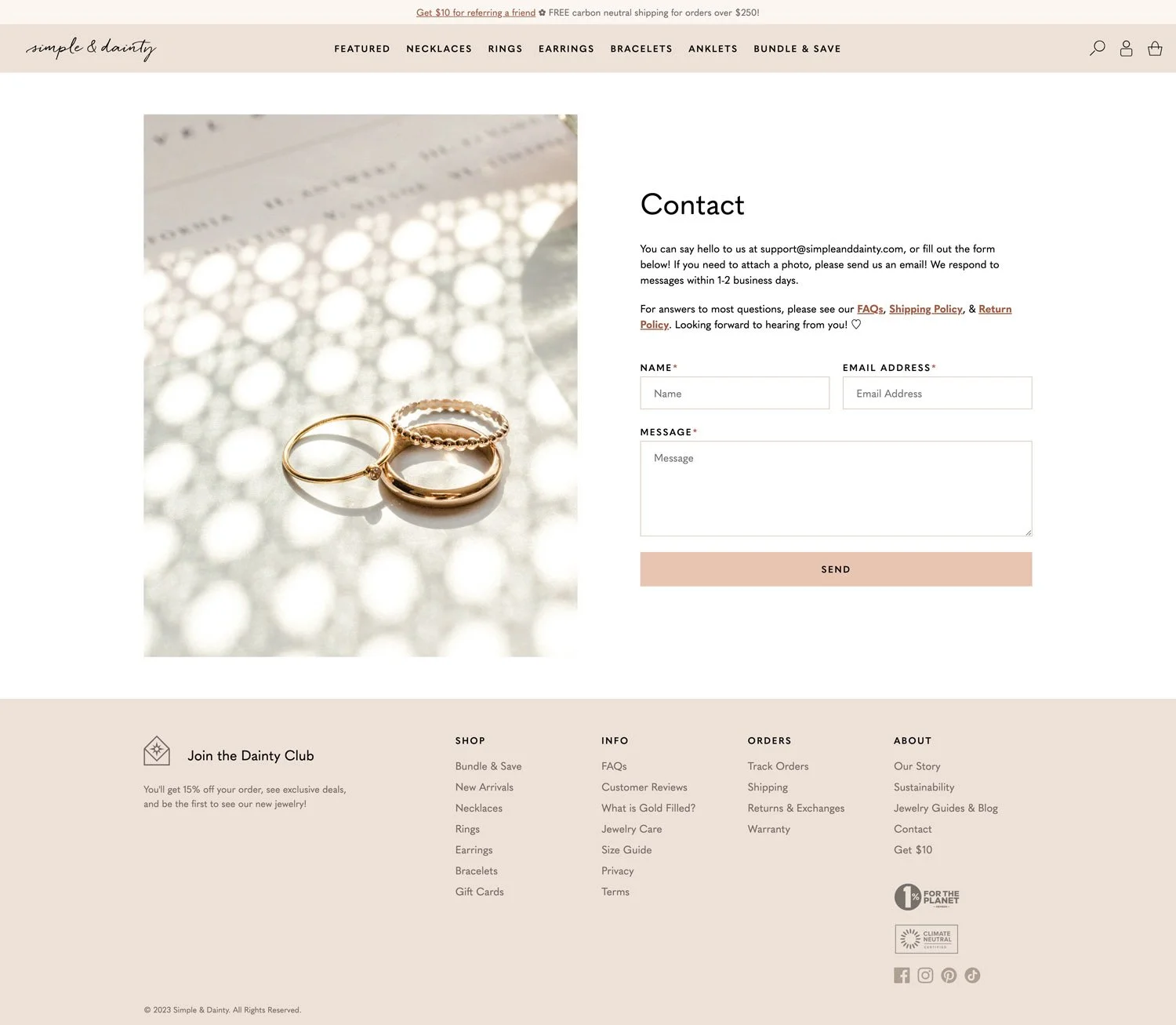
Contact Page Design Example: Simple & Dainty
Website: Simple & Dainty
Designer: NK
What I love about this contact page design example
Simple & Dainty by name, Simple & Dainty by nature… this page shows you don’t need complex options, AI or jazz. That an effective contact page can be a simple form, beautiful images a couple of useful links & clear expectations - beautifully done and bang on brand!
So there you have it - some fabulous, and hugely different contact page examples to whet your appetite & give you some ideas to start, or improve your Contact page!
Need a helping hand with getting it all set up?
Before you peace out, make sure to grab the Contact Page Design template!