7 crucial components for homepage design - how to build trust & gain clients
Your homepage is the face of your website, or your online reception if you will. Your homepage design is first impression that many visitors will have of you and your brand and therefore getting it right is pretty important. Sadly many small businesses miss the opportunities that their homepage provides, and end up losing more clients than they gain.
Luckily to design a homepage that builds trust and leads your visitors to take the next step in their relationship with you doesn't need to be complicated.
There are 7 crucial components for your homepage design and in this post I break down what they are, in what order they should be included and some great examples from the wilds of the internet.
Before we begin I want to clarify a little bit of homepage terminology that I will be using to define a specific part of your homepage - above the fold.
This post may contain affiliate links. These are denoted by a *. If you make a purchase via one of these links I may get a small kickback. I only recommend products and services I use and love myself! Thanks in advance :)
Before we start - make sure to grab your very own homepage content planning template & use it to follow along with the post below - it’s designed especially to support you to implement the steps below & demystify & simplify the whole process! 👇
What is above the fold on a website?
When you arrive on your homepage, before you scroll, down you have a section that is called in industry circles “above the fold”. This section is the most valuable real estate on your website and it is here that we need to capture the attention of your visitors so that they begin their journey of finding out more, trusting you and ultimately taking the next step to working with you!
Data suggests that people make an opinion about your website within 0.05 seconds and decide whether to scroll or bounce - I can’t emphasise enough how important your above the fold section is on your homepage!
Some of the elements that I discuss below should come in this section, for others it doesn't matter too much as long as they’re somewhere. So with that in mind let’s get to the 7 crucial things to include on your homepage…
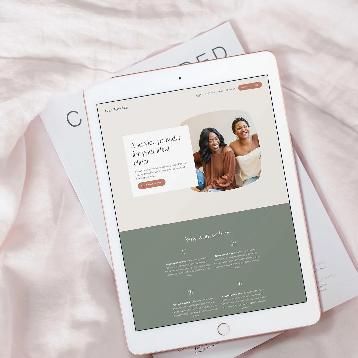
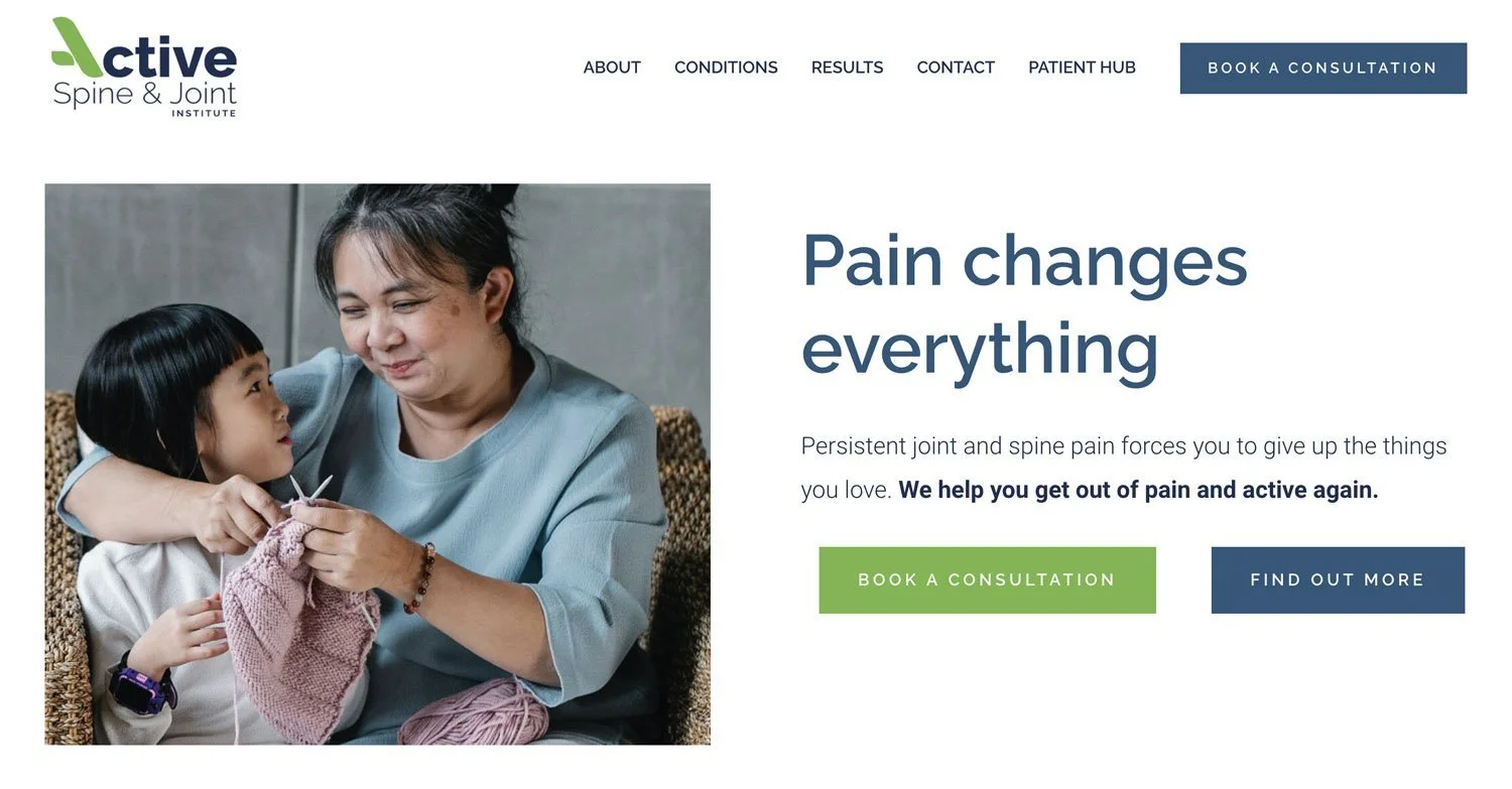
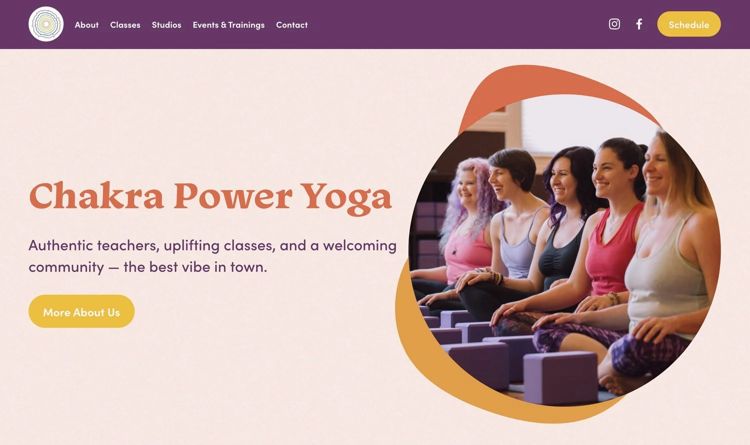
Who your website serves and why it matters
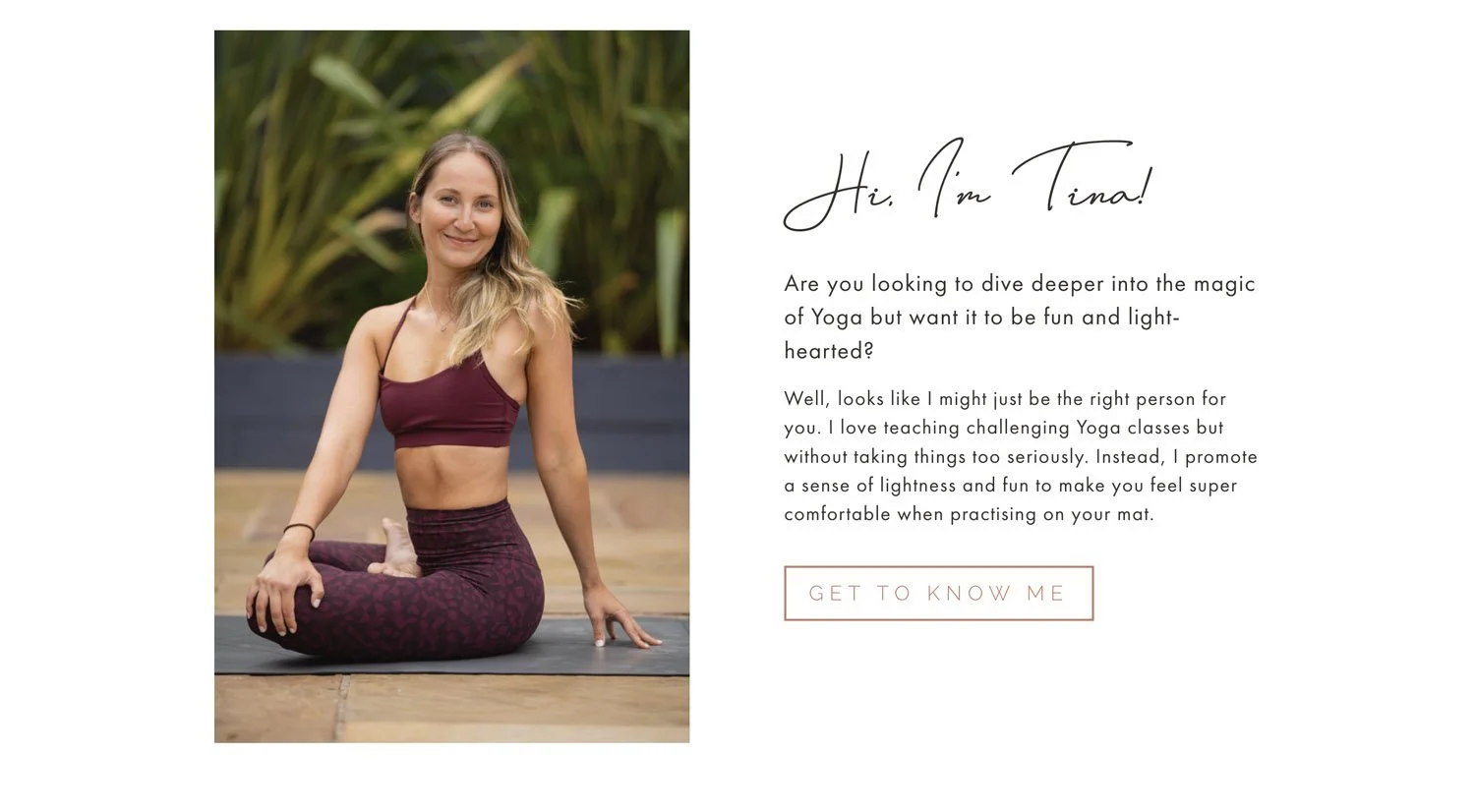
The first thing that should be clear when someone arrives on your website is what you do, who you do it for and why it matters.
Of these three things the “why it matters” is the most important.
It’s the “why it matters”, or the change that will happen as a consequence of investing in your product or service that people will invest in, more than what you actually do.
This text can also be called a title or tagline, and should sit “above the fold” or in the “hero section” that people can see before they begin to scroll down.
Struggling to define who your site’s for?
Grab my FREE ideal client workbook & get crystal clear before you go any further (seriously - it’s totes worth the effort!)
What makes a good title and tagline?
A good title and tagline should include why you exist (i.e. the impact your product or service has on someone), what you do and where you do it.
The “why” is the most important part of this, because it’s the why that drives people’s buying decisions (not seen Simon Sinek’s TED talk on golden circles before - check it out it’s a gem!)
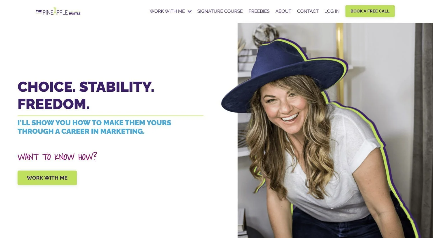
To make this more concrete, here are some examples
One less worry on the list
Legally sound contract templates for creatives, without the expense of an hourly rate
The why? Feel safe and secure / worry less
The what? Contract templates with a reasonable price tag
The who? Creatives
The where? NA
More money for the things that matter
Reduce your monthly payments through refinancing with Silicon Valley Mortgage
The why? More money to spend on what matters to you
The what? Refinancing
The who? (Shown via the image in this case - an image of a retired couple doing something they love)
The where? Silicon Valley
Achieve your fullest potential
Empowering world class lawyers to be limitless leaders through coaching
The why? Achieve your potential
The what? Coaching
The who? Worldclass Lawyers
The where? NA
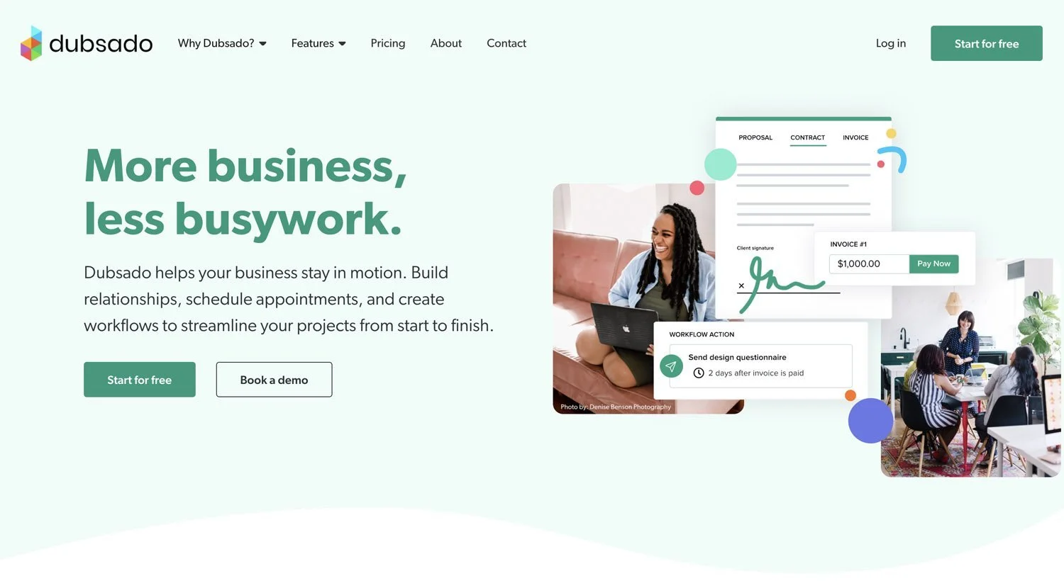
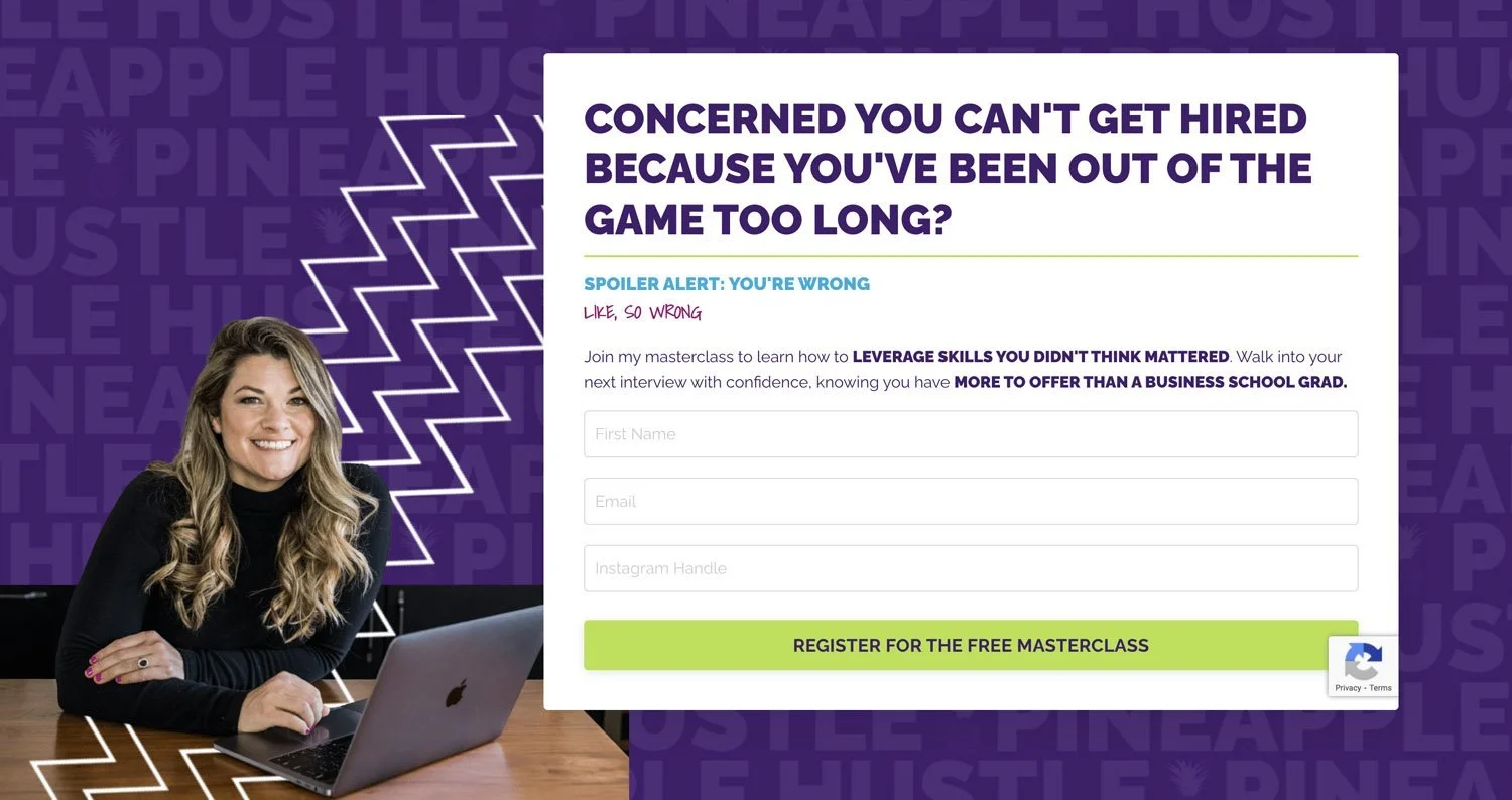
See below for some examples of compelling above the fold copy (see if you can also see examples of CTAs .. we’ll talk more about this in the next section!)

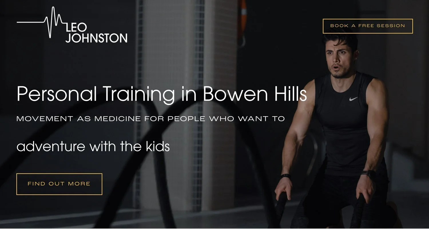


2. Clear Calls to Action
People like to be guided and have an obvious next step - yet calls to action (AKA CTAs) are often missing from homepages - around 70% don’t include a Call to Action.
This is a serious missed opportunity!
For the avoidance of doubt a call to action or CTA is a button that people click on to take the next step - this could be something like “Book now”, “Find out more”, “Contact me”, “Add to cart” or similar.
You should have at least one CTA “above the fold”, although I recommend 2 - one lower bar (something that doesn't require a big commitment such as “Learn more”) and another higher bar which is more orientated toward your website goals such as signing up for a freebie or booking a free discovery call.
Good practice is then to include other CTAs throughout your homepage, usually around 1 per page section, using a mixture of lower bar “find out more” type CTAs and higher bar “book / download / enquire” depending on your main website goals.
See below for examples of CTAs on homepages - focussed on the above the fold section
Haven’t grabbed the homepage content planner yet? Here you go (you can thank me later!)
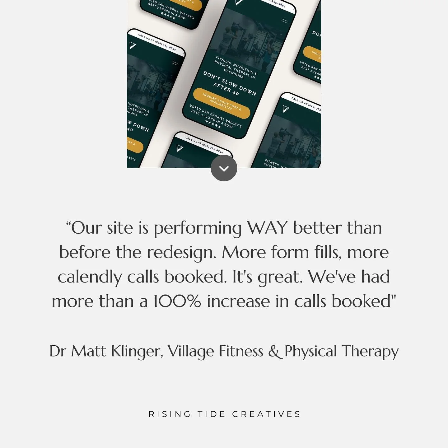
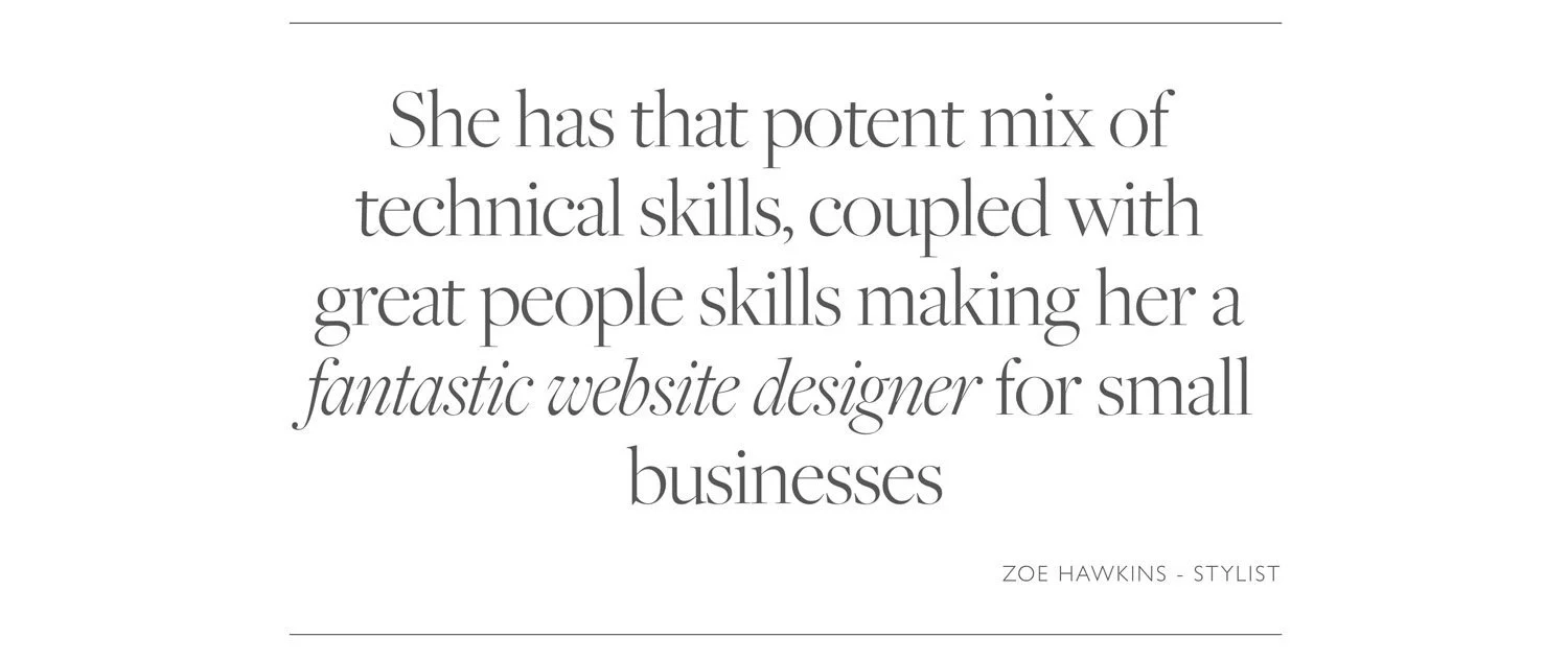
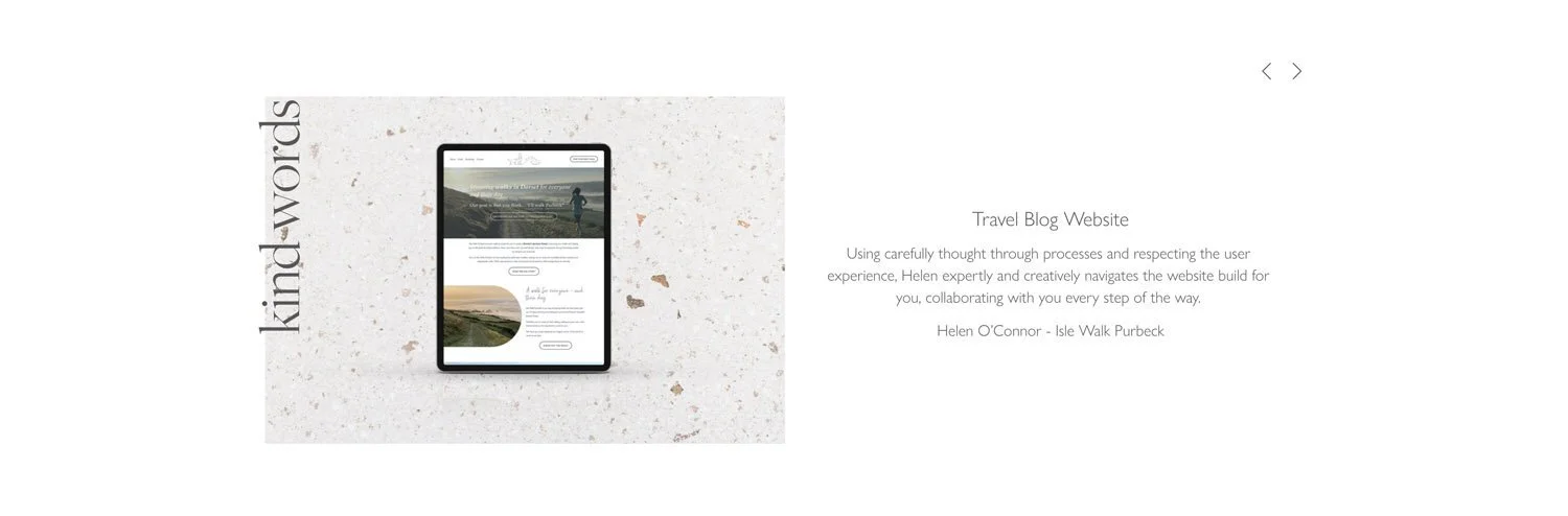
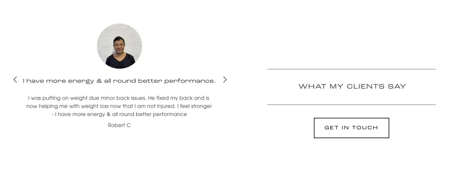
3. Social proof
When we consider that the main purpose of your homepage (and in fact your website overall) is building trust so that people take the next step in their journey with you, it’s clear that a great way to do this is by providing what’s known as “social proof”.
What is social proof?
Social proof is content that provides a 3rd party confirmation of your brilliance! They have been proven to be incredibly powerful in supporting buying decisions.
Some examples of social proof that you can include on your home page include:
Trust icons that show the logos of businesses that you have worked with, been featured in or approved by.
Testimonials whereby you share snippets of feedback from happy clients.
Case studies whereby you share a more in-depth overview of a client or customer and the impact your service or product had on them.
Reviews that show real time verifiable reviews from a 3rd party platform such as google.
Stats that relate to your business - e.g. number of purchases/ clients/ websites launched etc
It’s worth highlighting here that different types of social proof carry with them different levels of kudos. For example, the more well known and respected your advocates are, the more you bask in the reflected glory and the more likely people are to be swayed by their opinion.
And a note on reviews - those that are via a 3rd party such as google or facebook will naturally carry more weight than those you added to your website yourself as they are more likely to have been added by a real person as opposed to you making someone up and adding them (I know you wouldn’t do that - but some people would and therefore verifiable reviews that come from 3rd party platforms are seen to be more reliable).
That’s not to say that testimonials collected from your clients and added by you can’t be powerful - a well written one, with an image, and/ or link to the person in question can be valuable social proof indeed.
Where should social proof go on your homepage?
I recommend that you have at least one piece of social proof immediately below your hero section, ideally above the fold (before the scroll!) as it’s such a powerful tool to build trust. You may also include other elements of social proof content (testimonial soundbites, reviews etc) throughout your homepage and your website as a whole.
Here are some examples of social proof sections using a variety of these approaches…


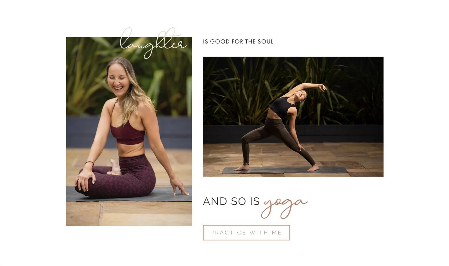
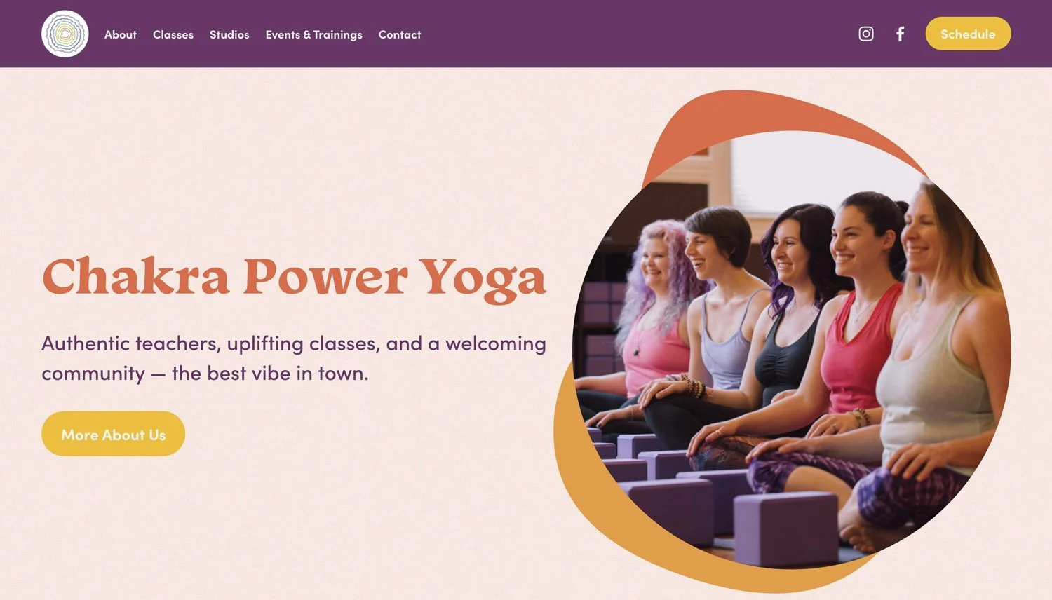
4. Images that speak
If a picture speaks a thousand words, in no place is this truer than on your homepage. Of course it’s important to include great, clear and compelling copy, but images that communicate to your audience about what you do, and more importantly how it will impact them and make them feel are the most powerful way to say what you’re about.
In fact the brain processes images much faster than text, and knowing we have such a short time to make a good first impression makes using a carefully selected image above the fold on your website a no-brainer.
The hero image and why it matters
The most important image on your website is your hero image, the image that is above the fold. This image should connect with your tagline - most specifically the “why” of your tagline, i.e. an image that shows the impact that your product or service has on your ideal customer.
For more on how to choose images for your website using my emotion led approach - read this.
This image can be a full screen banner, or a smaller image next to the text, but either way the message this image gives should align with your title and tag line.
After this, images that continue the same feeling scattered throughout your homepage to emphasise your core message, your “why” are crucial. Don’t forget to compress your images before adding them - stats show that slow loading times are a trust (and patience) killer, not to mention google will not love you for it! For more on how to optimise images for your website read this.
Here are some examples of powerful hero images that capture emotion and communicate the feeling of the impact the product or service is seeking to have…


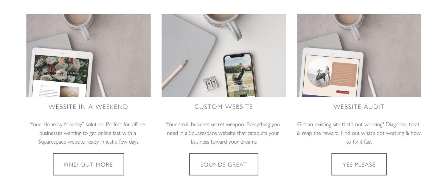
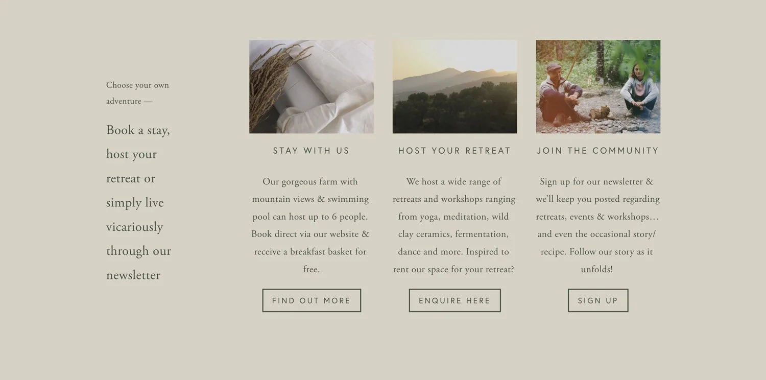
5. An overview of your products or services
Once we’ve covered the “who”, the “why” and the social proof we can start to clarify the what and the how.
Knowing that 86% of users expect a homepage to cover (at least at a basic level) an overview of products or services - this is an important section not to miss.
Although we will likely expand on this on supporting pages, the homepage is a great place to make clear and concrete what you offer, ensuring that people aren’t left with any confusion as to whether you’re the right fit for them.
This section can come further down the page, but ideally in the top half if your homepage is a long scroll. It often makes sense to add a CTA by each product or service to allow people to find out more about it - these CTAs should normally lead people to your services pages, or store if you’re selling products.
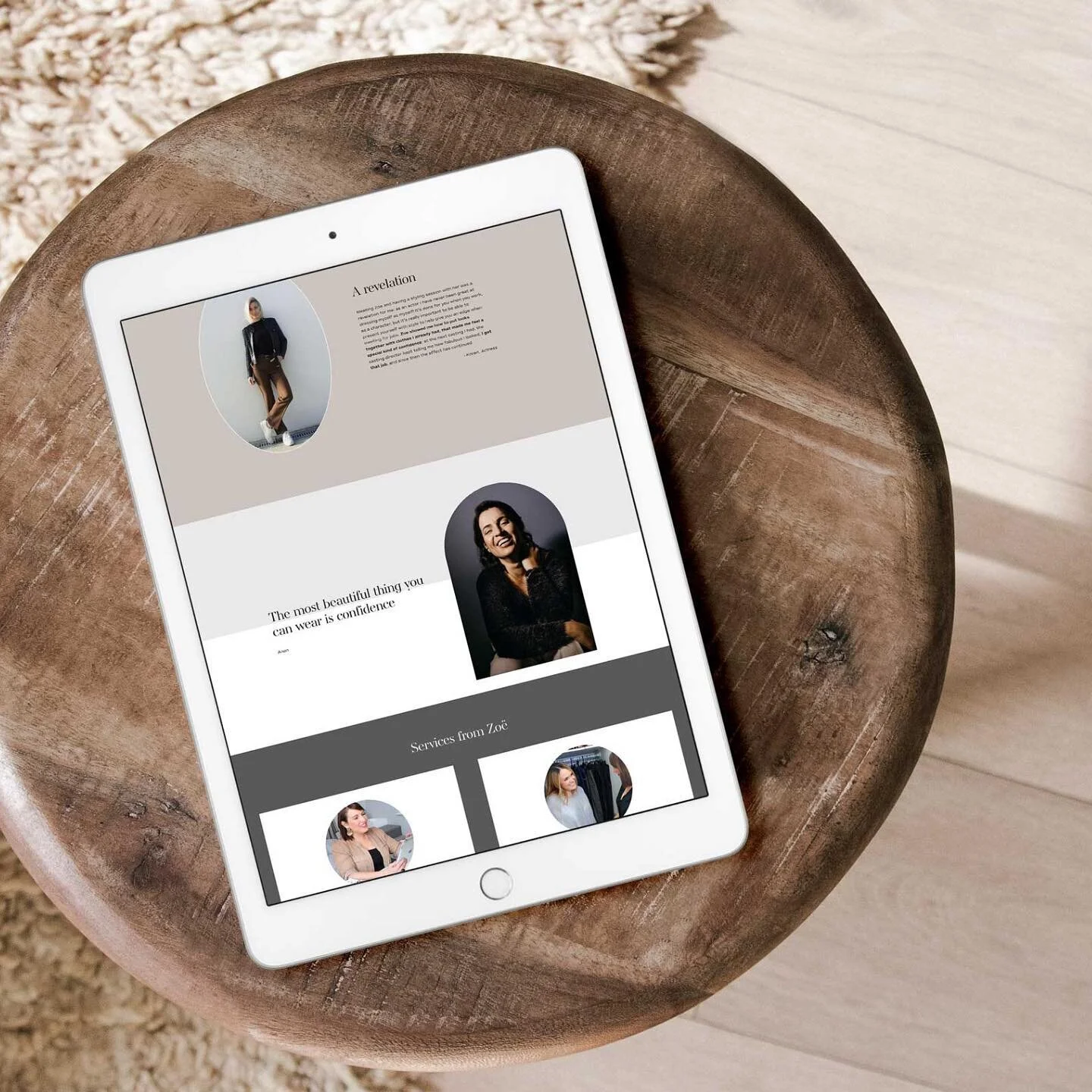
See below for examples of service summaries from a range of homepages

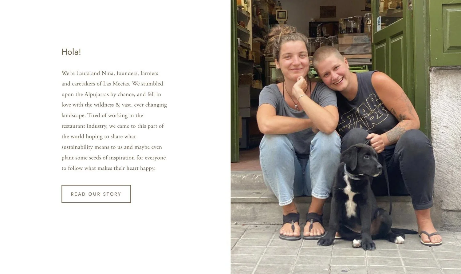
6. A bit about you
Operative word here being “bit”.
The majority of your homepage should be speaking to your ideal client - i.e. about them, not about you, however a mini introduction or about section on your homepage written in such as way as to build trust can humanise you and your team (if you’re a service provider). Or give further credibility and confidence in you and what you’re about if you’re a product based business.
In this mini intro section it can be great to consider what the main concerns people might have about you or your business and pre-empt them by highlighting your strengths, and highlighting the human and relatable parts of you - people connect with people. Don’t forget a picture that shows your face!
A good CTA for this section is often “find out more about me/ us” and a link to your about page.
Need content ideas for your about page too? Check out this blog post!
Examples of mini or summary about sections from a selection of home pages

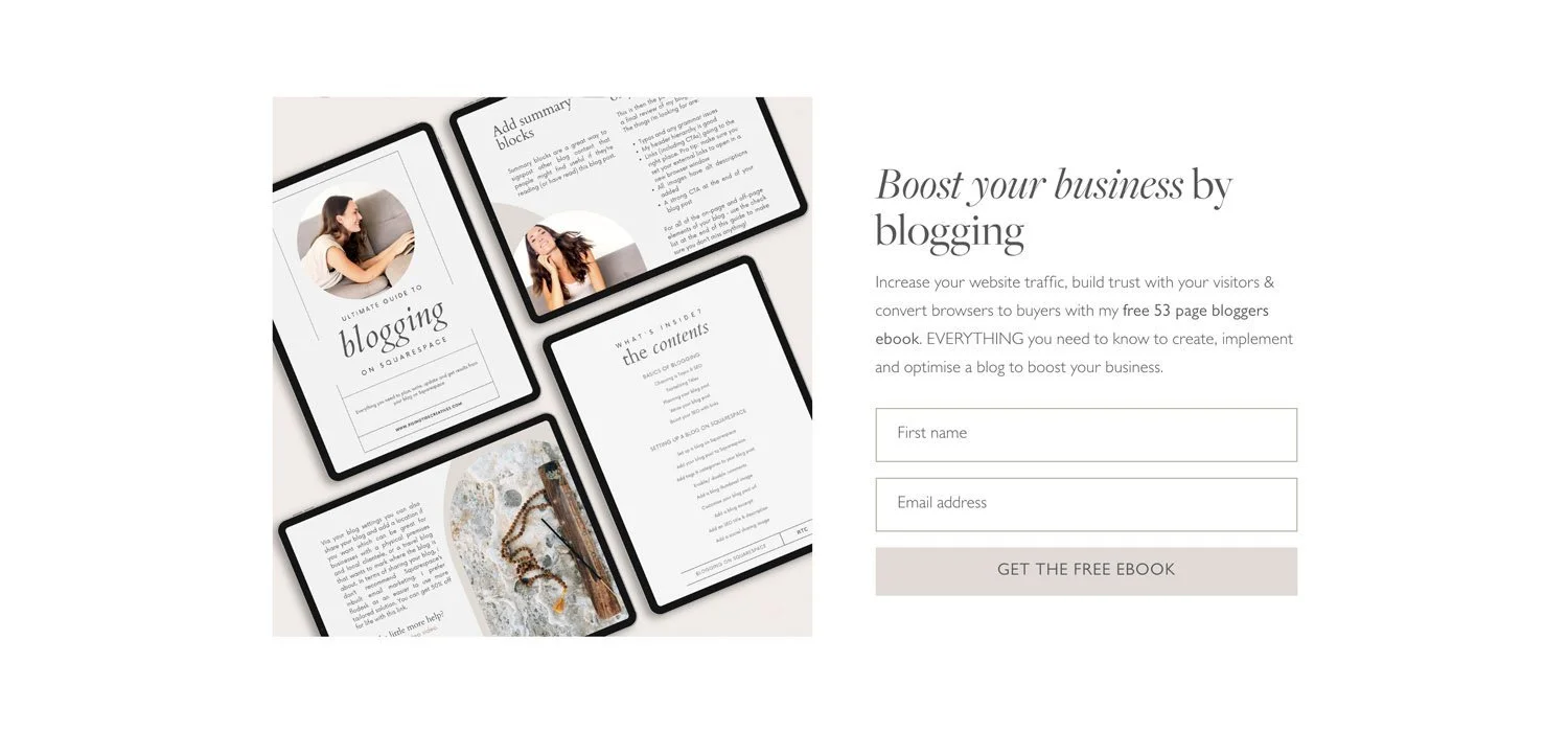
7. A way to stay connected
If you’re not building your email list yet where have you been?! It’s my top priority for pretty much any small business and something I really recommend you start with if you haven’t already.
Whether you’re building your list using a lead generator (accessing a freebie or completing a quiz in return for giving you their email address) or simply offering an opportunity to join your community or list, you need a way for people to get on your email list before they leave your homepage.
Even better, a pop up email sign up block that means people can’t miss it (be cautious with this to avoid it being annoying - ensure your settings are such that it doesn't keep popping back up after someone’s already signed up!!)
If you’re using an inline form (i.e. a form on the page itself), consider how it’s designed to make sure it stands out from the rest so no one misses it!
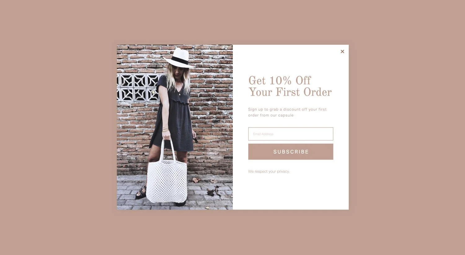
Examples of email sign up forms


A final little extra - don’t forget to check out your homepage on mobile and make sure it looks great there too, with over 50% of web traffic coming from mobile , and as many as 91% of small business websites not optimised on mobile it’s a great place to get a jump on the competition and stand out from the crowd!
So there you have it - the 7 key components to include on your homepage to build trust and gain clients.
Need more of a helping hand?
Grab my FREE Squarespace Website Template - it’s packed with good practices, and gives you a step by step guide to getting not just your homepage, but the rest of your website up & not only looking beautiful, but ready to convert browsers to buyers too!
Found this post useful?
Check out more web design blogs…


New on the ‘Gram…