How to Choose Images for a Website Wow Factor
Along with your website font selection and colour palette the most important component of your website design is the images you choose for your website. With 94% of website first impressions being made based on visuals I’m not exaggerating when I say image selection can make the difference between a professional looking, high converting website, and a big ol’ mess.
Luckily, with a little know-how, selecting great images for your website doesn’t need to be difficult. In this post I am going to go through everything you need to know to choose images for a real website wow factor. Let’s get started…
This post may contain affiliate links. These are denoted by a *. If you make a purchase via one of these links I may get a small kickback. I only recommend products and services I use and love myself! Thanks in advance :)
Top tips for website image selection
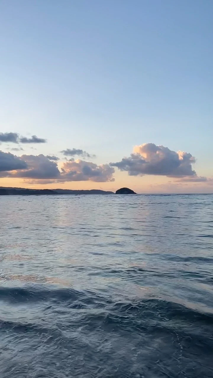
Choose the emotion you want to evoke through your website images
Out of all of the selection decisions for your website images, emotional response is, in my view, the most important. Research shows that certain images can shift our emotional state and even lower our blood pressure! There are two main types of emotional response you may wish to evoke via your website images
Evoking an emotion that doesn’t already exist (or an “aspirational emotion”)
To do this we want to identify how our website visitors are likely to be feeling when they visit us, and how we’d like them to feel after being on our website for a little while. This is often (but not always) evoking a sense of calm, or order, or security/ safety for people who arrive feeling stressed, overwhelmed or out of control. Our image selection then stems from choosing images that help to bridge the gap between the existing and desired emotions.
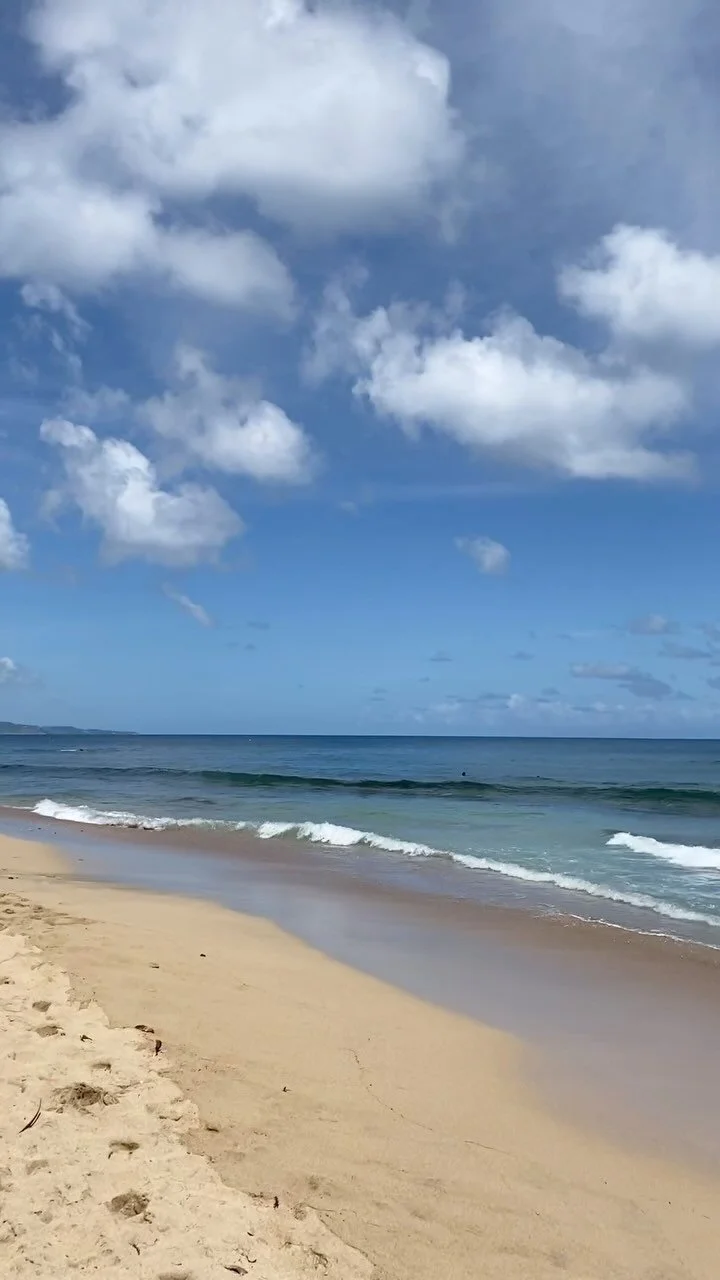
Reinforcing an existing emotion
Sometimes people will visit your website already feeling an emotion that you want to maintain and capitalise upon. This might be excitement for an events website, romantic for a wedding site or cute and cosy for baby clothes. You will want to capitalise on that emotion through your image selection.
Now, one of the things you’ll need to know before you think about the emotion you want to provoke is who is actually looking at your site… and that’s where your ideal client comes in!
Not sure what I’m talking about?
Grab the free workbook to get crystal clear on your ideal client today! (Trying to build your site without it is like trying to build a house with no foundations #knowwhatimean?!
Choose images for your website that communicate what you do
There are 4 categories of image here, all of which play an important role in communicating the purpose and practice of your business.
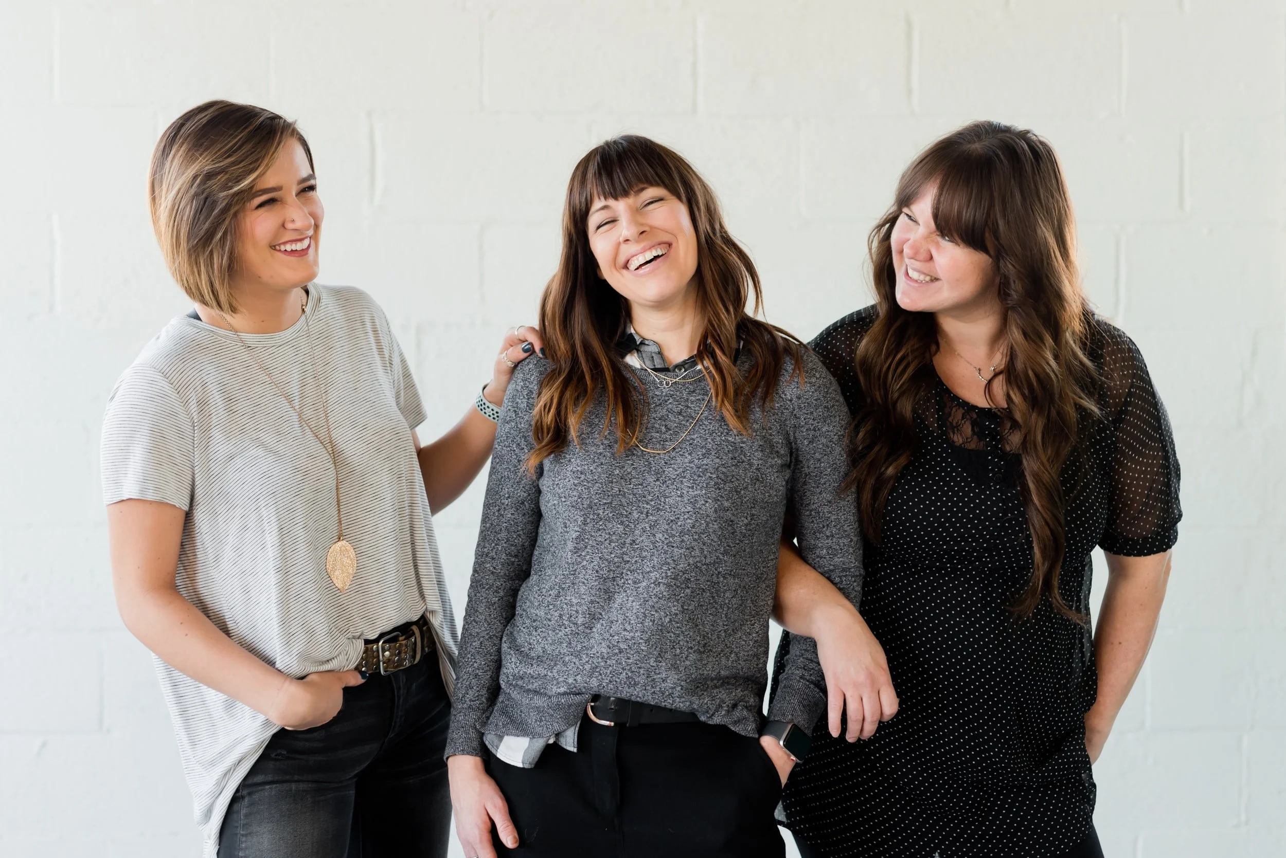
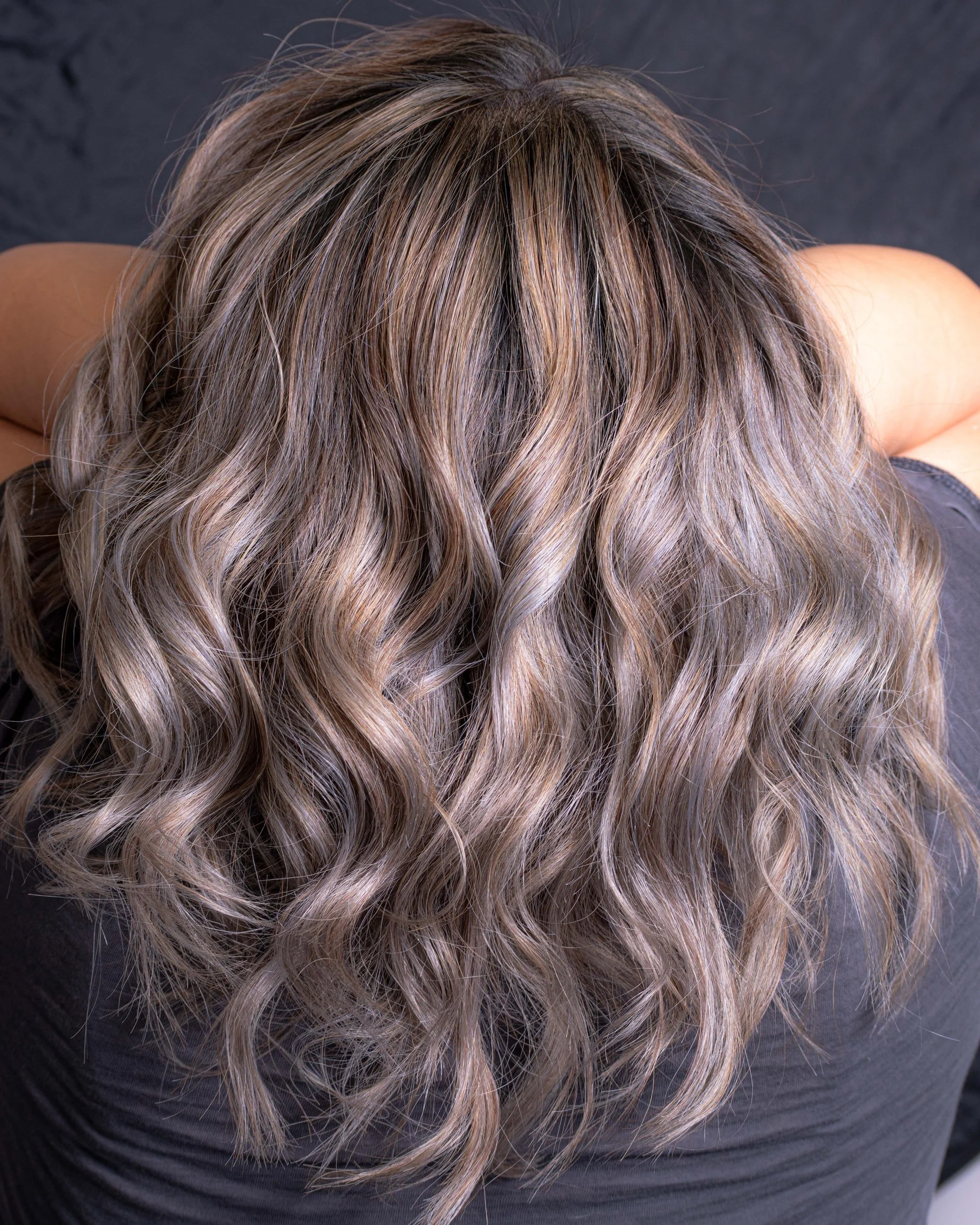
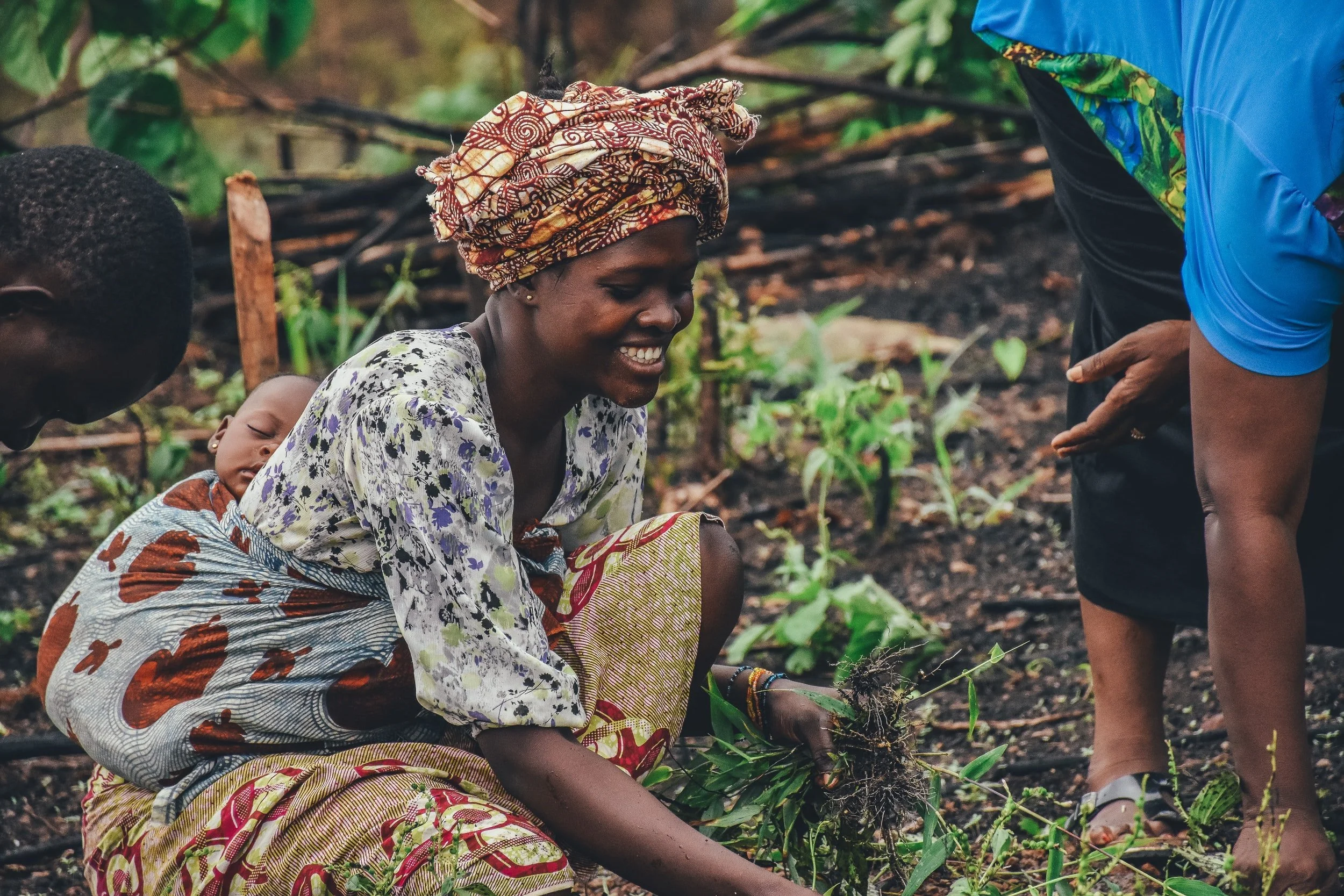
Images that portray the IMPACT of what your business does
That might be the confidence you give people through a great haircut, the freedom or time with family that you give via a great organisational system, or the feeling of calm from a fantastic massage. (This links strongly with identifying the emotion you want people to feel when they visit your website).
With the below images, although we see the hair more clearly in image 3 - the others portray more the feeling of having a new hair cut and feeling confident and fabulous!
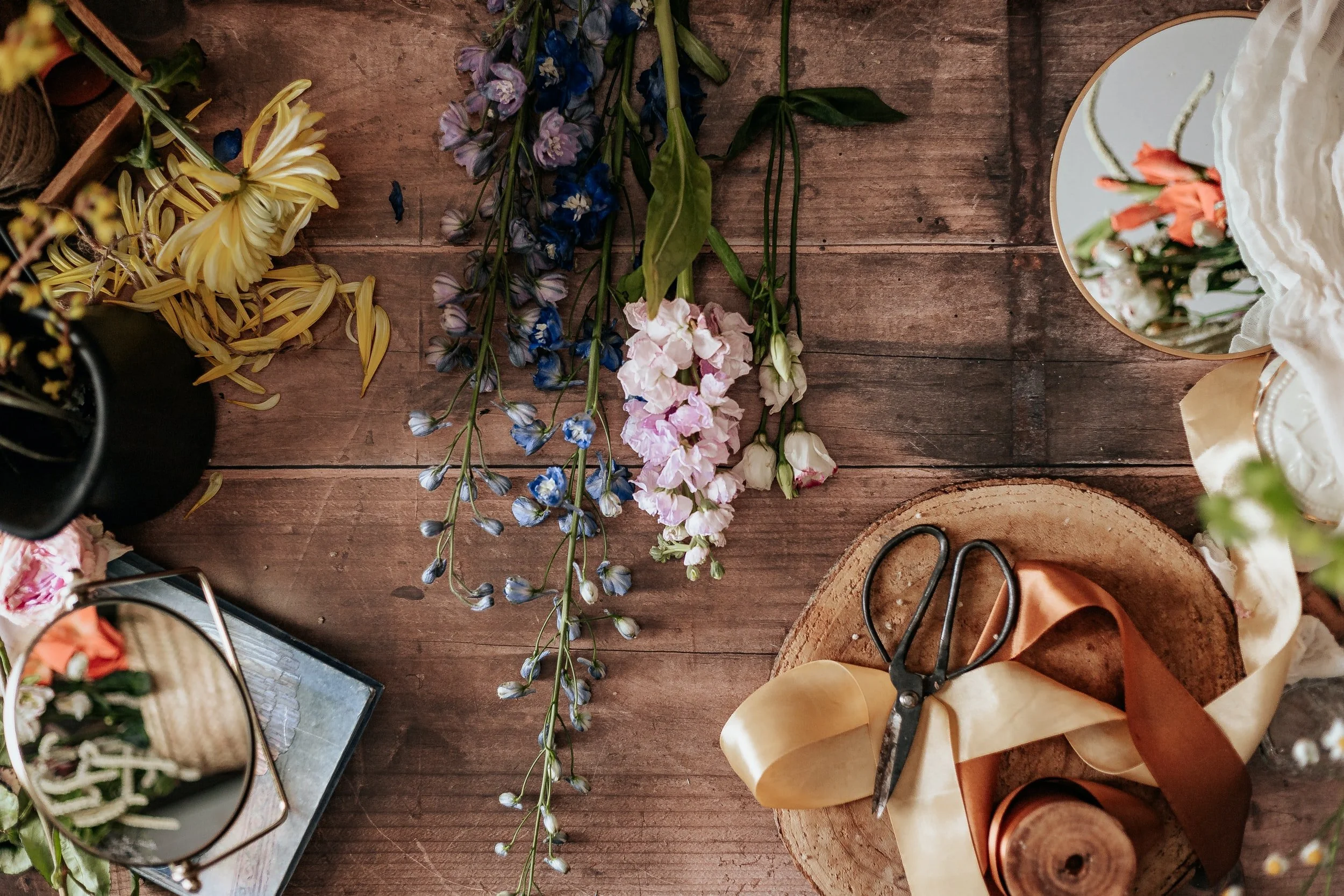
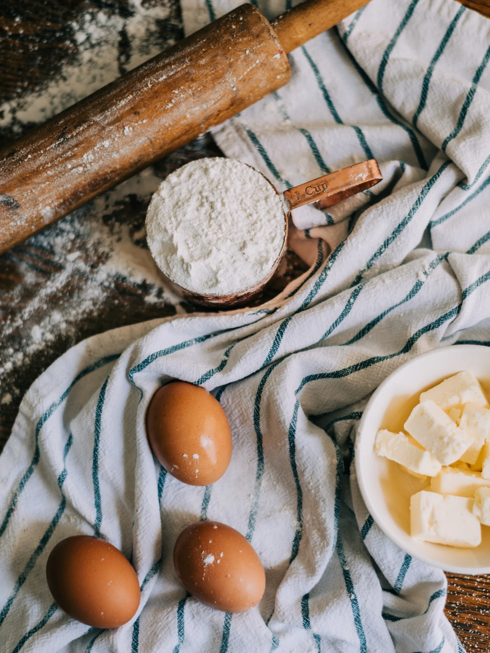
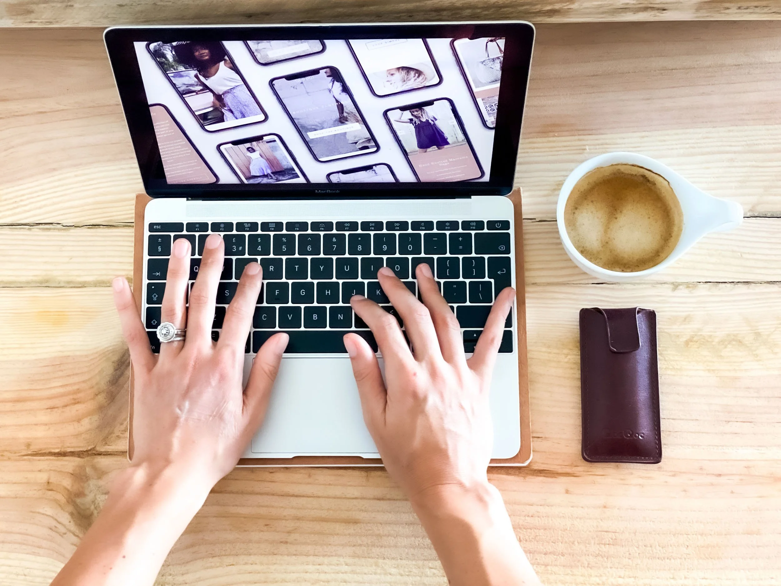
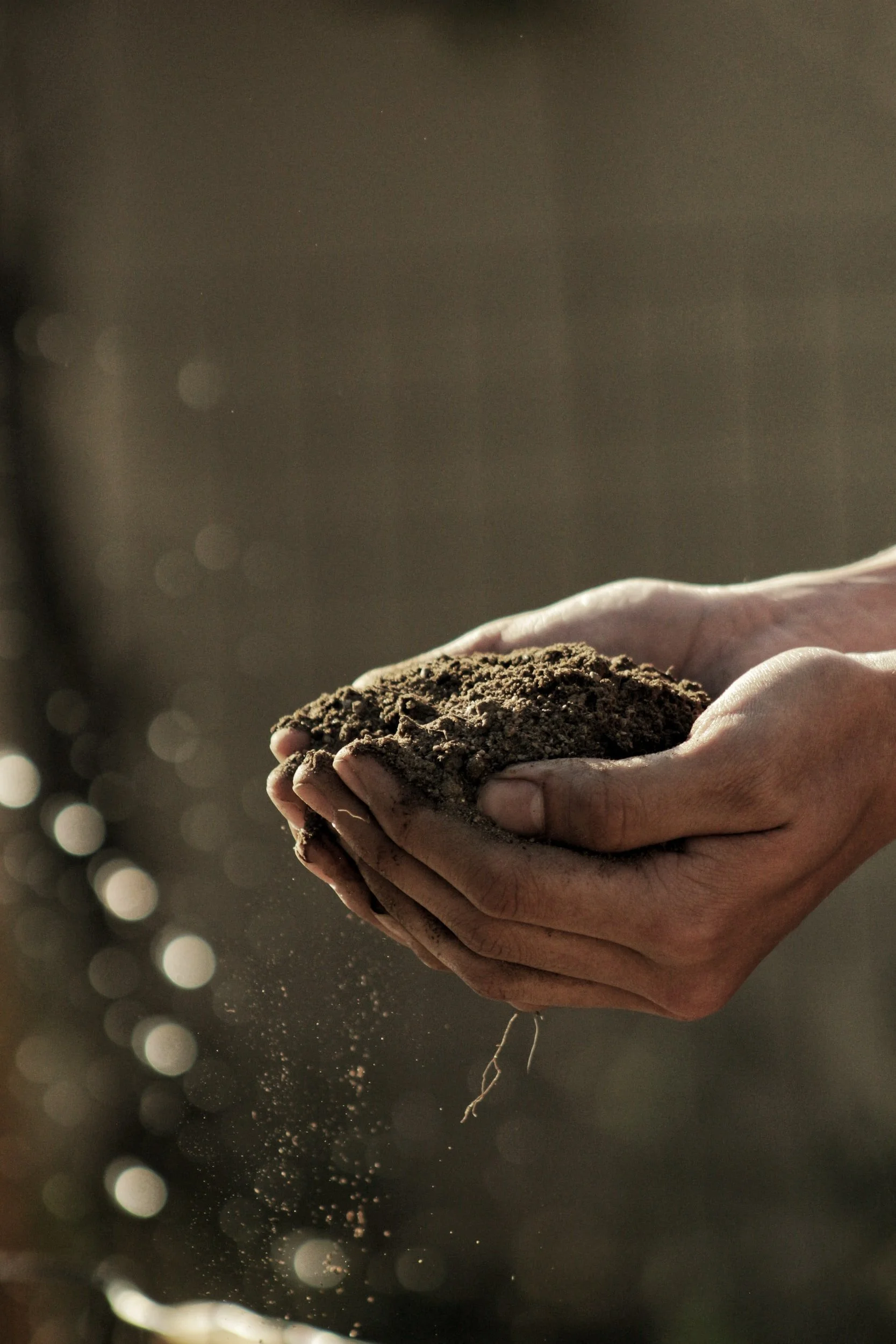
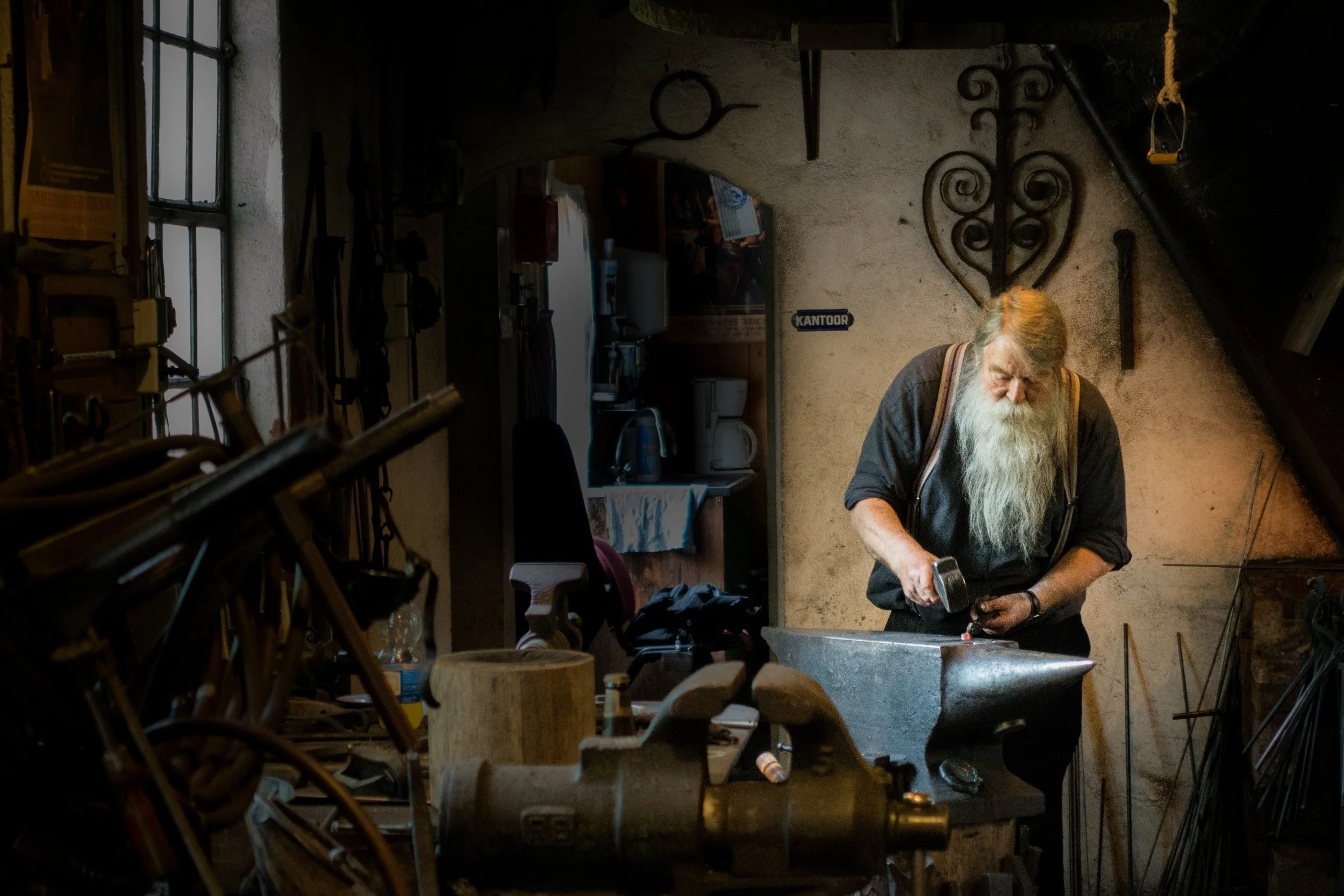
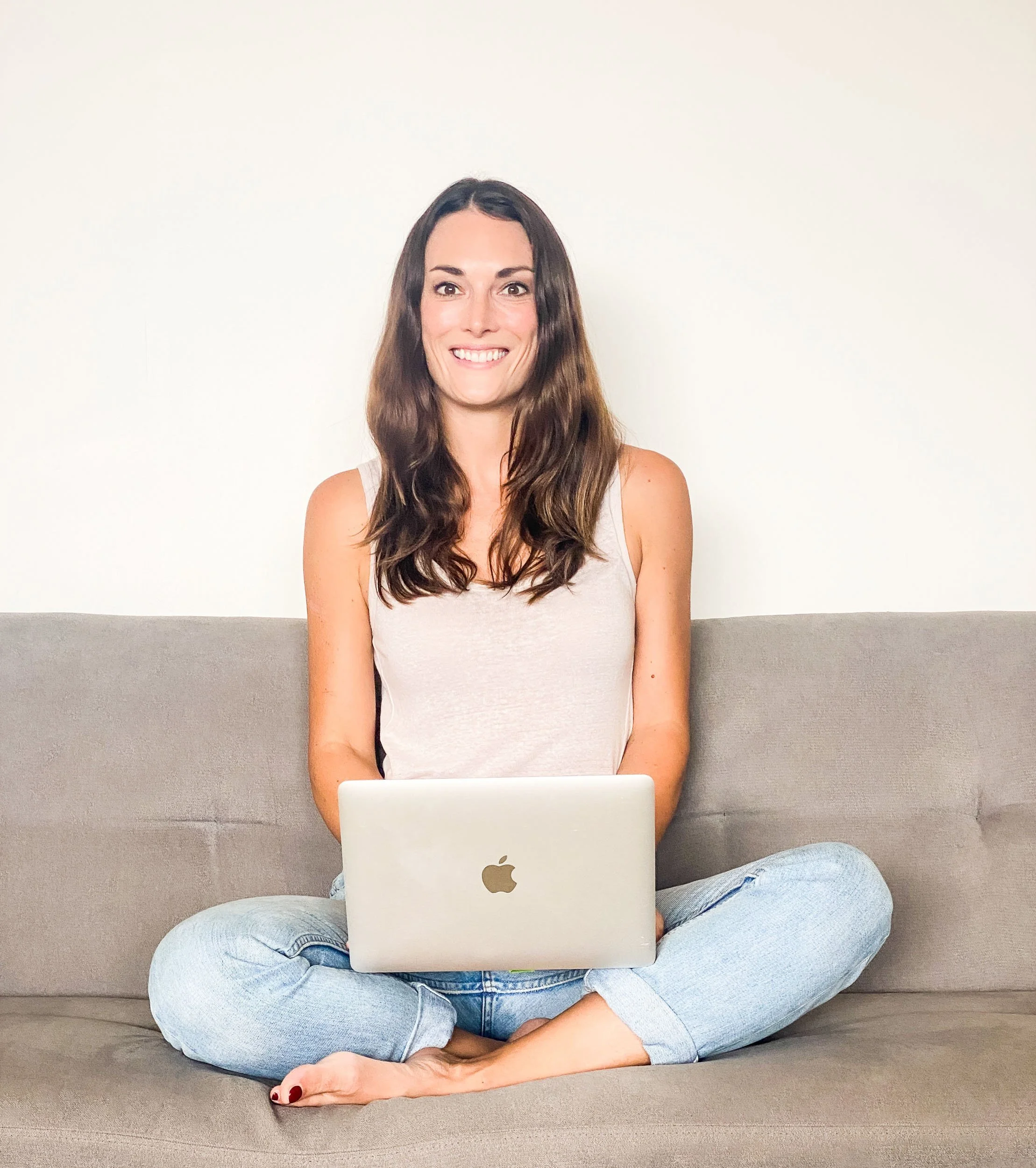
Images that show how your business does its work.
The tools of your trade - this could be literal tools if you’re creating something practical, or your laptop and coffee if you’re creating digital products. You may also wish to select images here that communicate your business values.
Here are some examples which communicate how the magic happens - your implicit messages here are good quality ingredients, a calm work space, products grown from rich soil and beautiful flowers and ribbons to create floral art works.
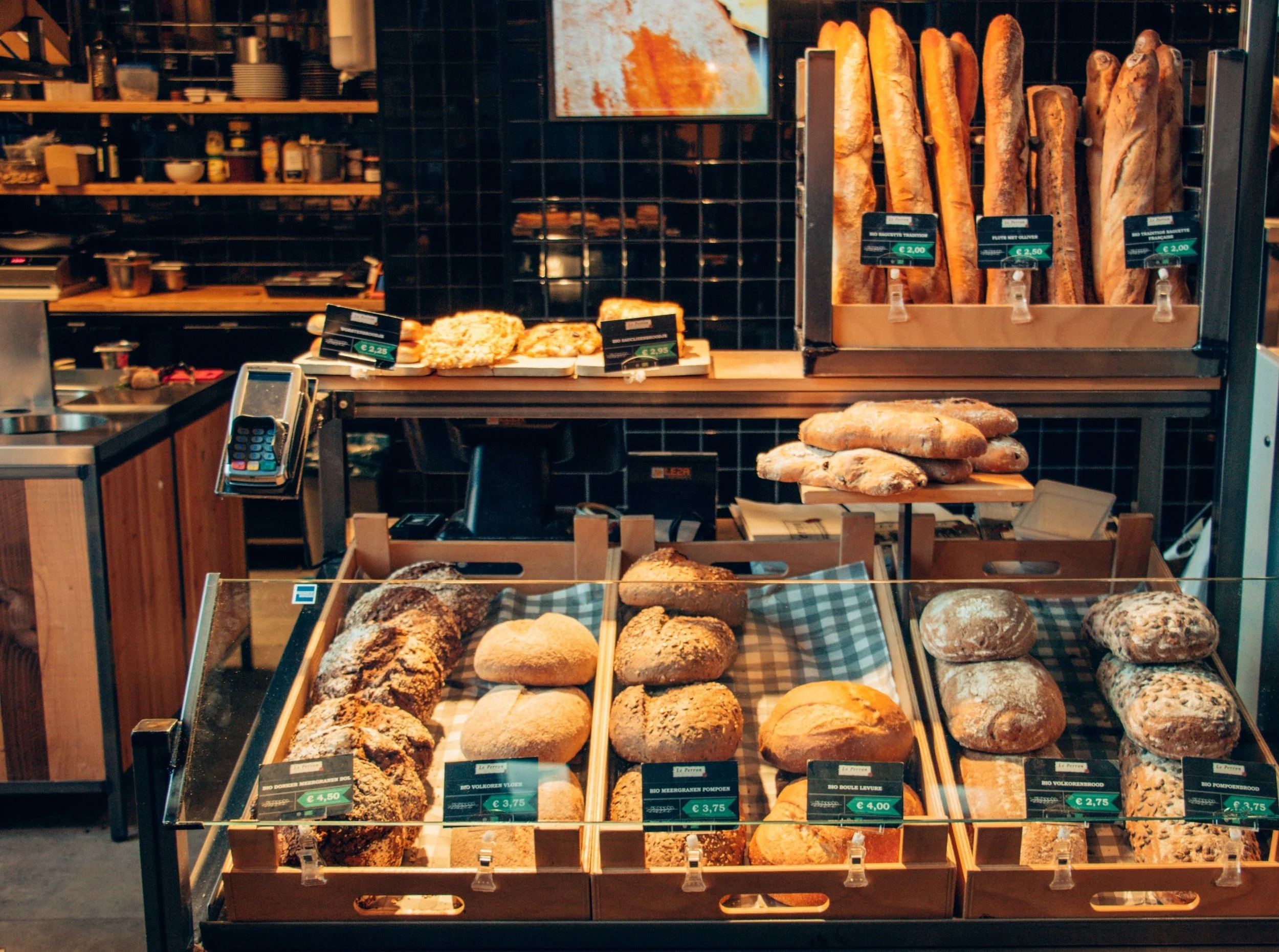
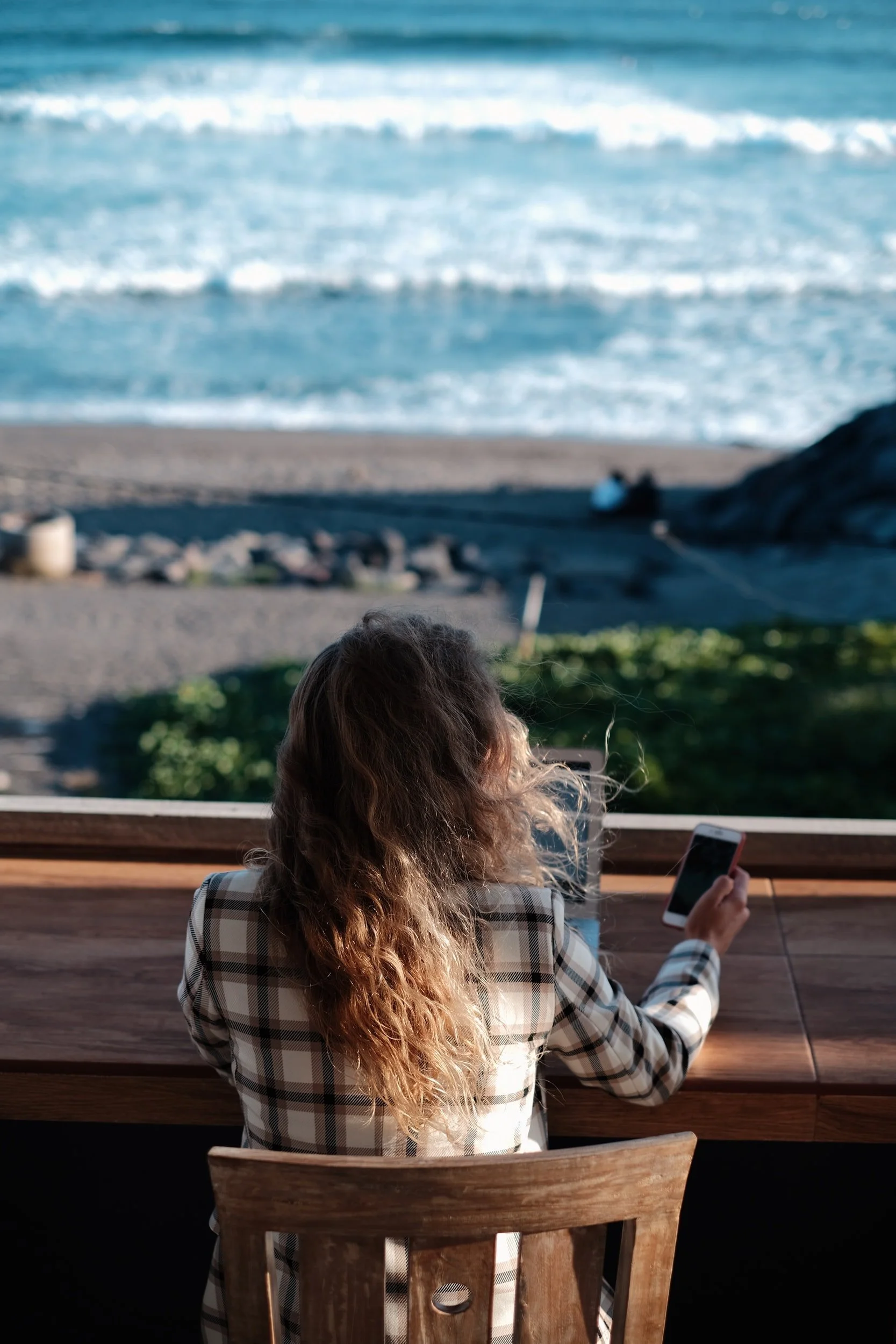
Where your business does its work
People like to imagine where the product or service they are purchasing comes from, or takes place. This can be your workspace - your view, desk, office, restaurant, shop or factory. Show off your product or service via imagery of the space you work from.
We can see what different messages each of these work spaces give off - a light, bright, modern collaborative space, a cosy bakery where we can almost smell the bread, the freedom of a “digital nomad” and the artsy tradition of an artisan’s workshop. Each workplace image gives the viewer a sense of the business.

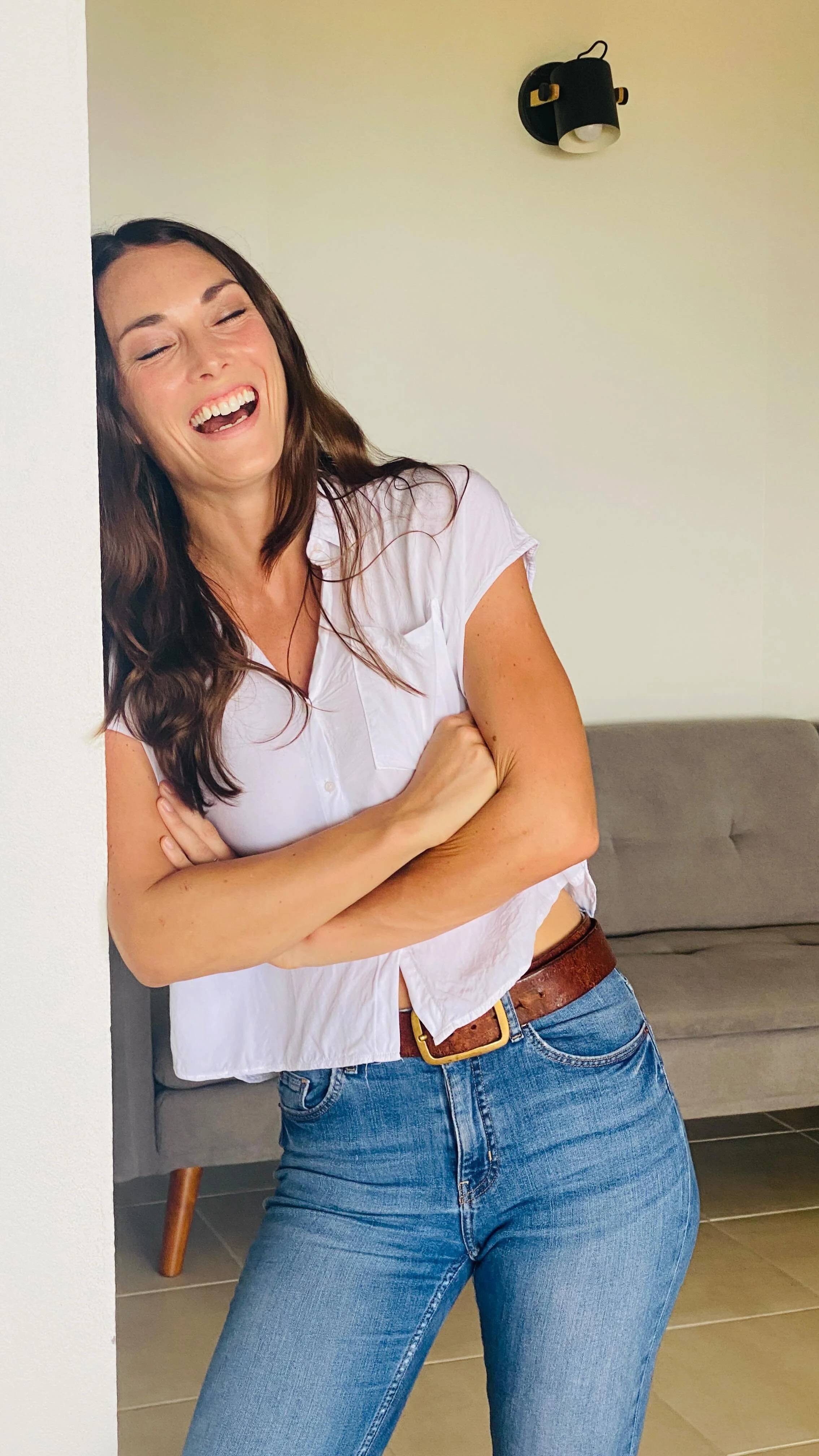
Images that show Who is doing the work
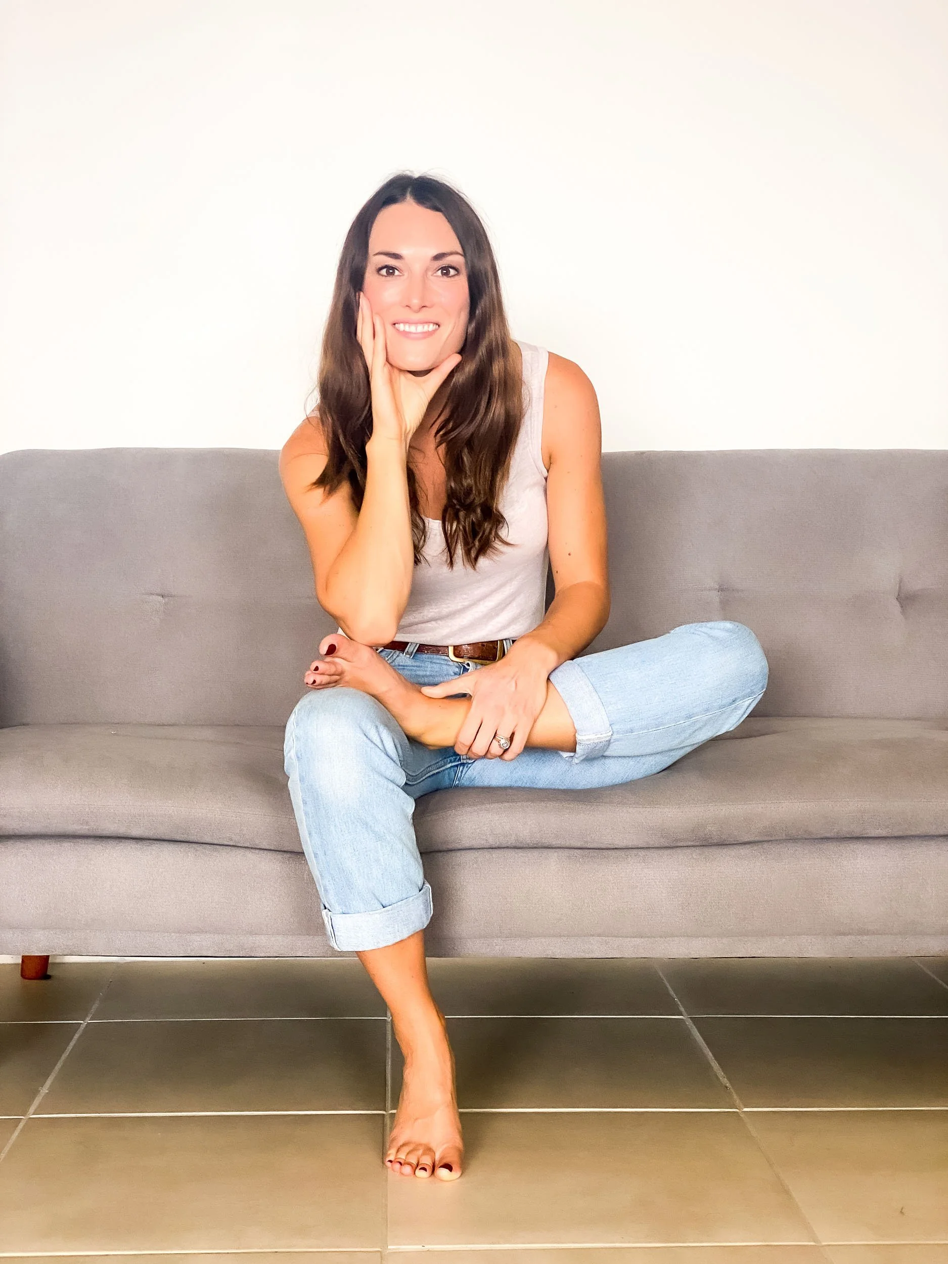
Even more important than where the work takes place (unless you’re a hotel/ restaurant/ cafe etc) include pictures of your people - this could be your team, or simply you. Avoid stock imagery here - real images of the actual people are great. I recommend a mixture of portrait images and “at work/ behind the scenes” images. Make sure that if you have a number of team members and want to have portrait style images of each of them, to do so using the same background, dimensions and lighting to ensure consistency.

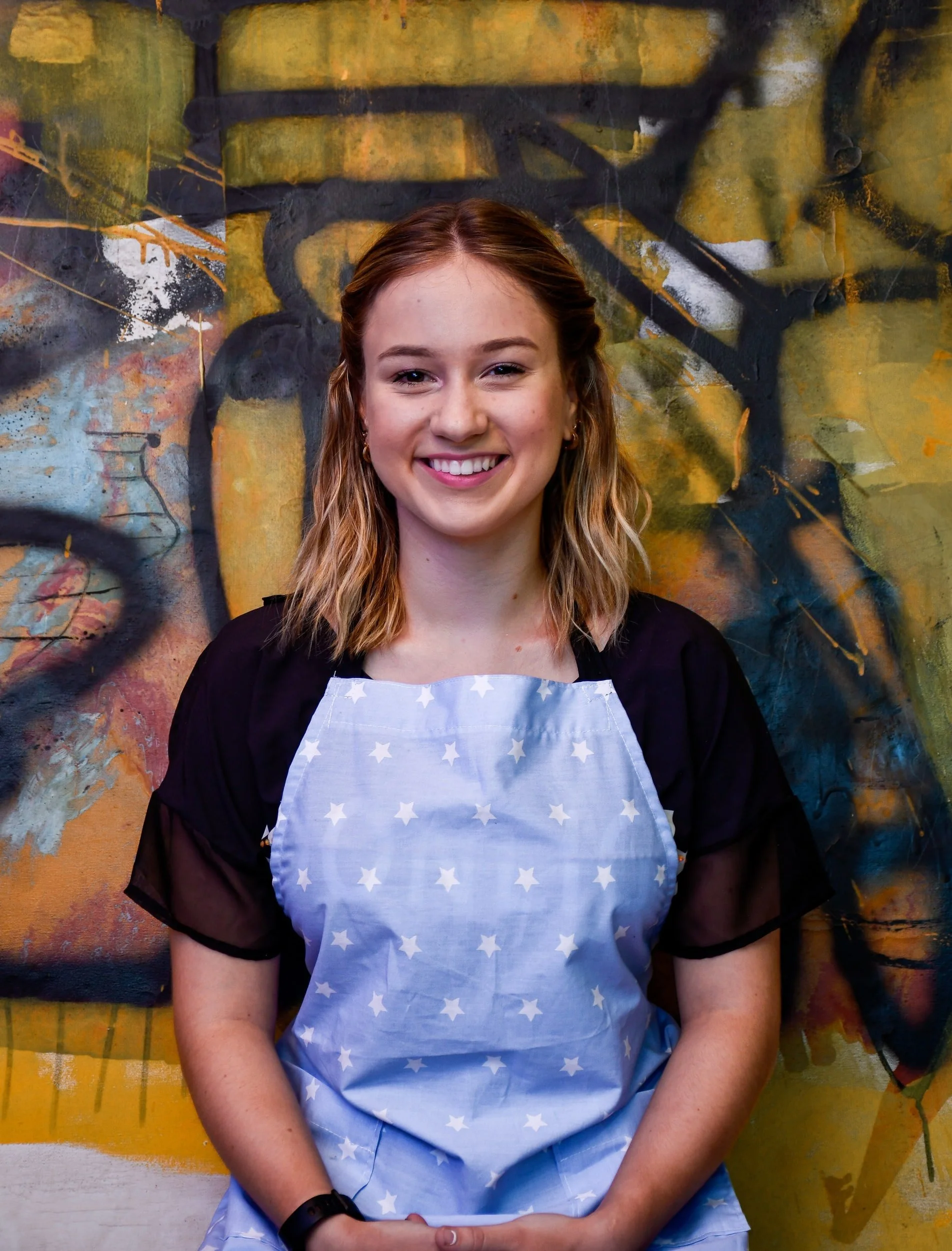
Read more on how to prepare for a professional photoshoot here.
Choose images for your website that show your ideal client
It might seem obvious, but be mindful that the people that you show on your website are similar to your ideal clients or customers. For example, if you’re a coach working with female finance professionals, showing professionally dressed women will ensure that your ideal clients see themselves in your images.
Be mindful however when choosing images of your ideal clients that you are as inclusive as possible - consider race, gender identity, disabilities, body shapes and sizes and LGBTQ as a few areas to be aware of representing as and where possible.
Not clear on your ideal client? Make sure to grab my free ideal client workbook - a simple step by step guide to getting crystal clear on who you want to work with, what makes them tick & how to attract & convert them… in droves…
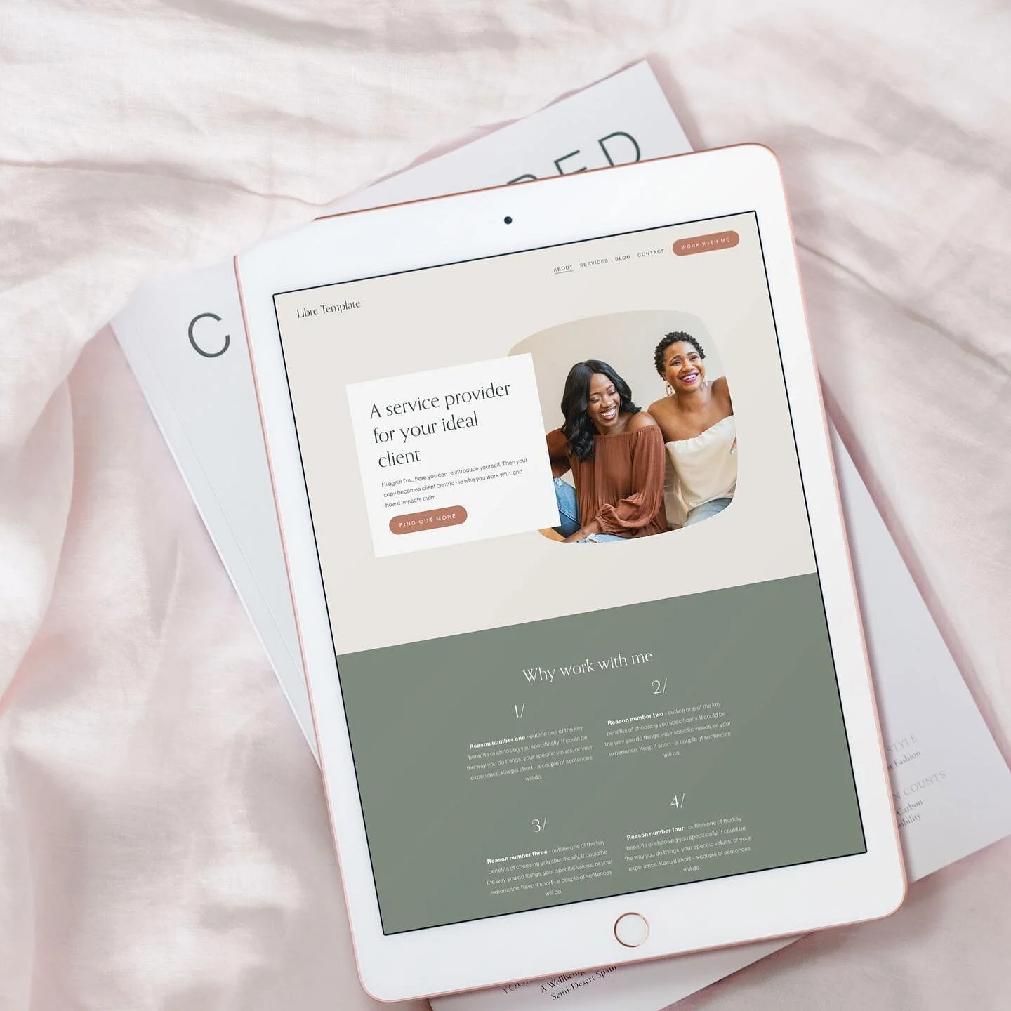
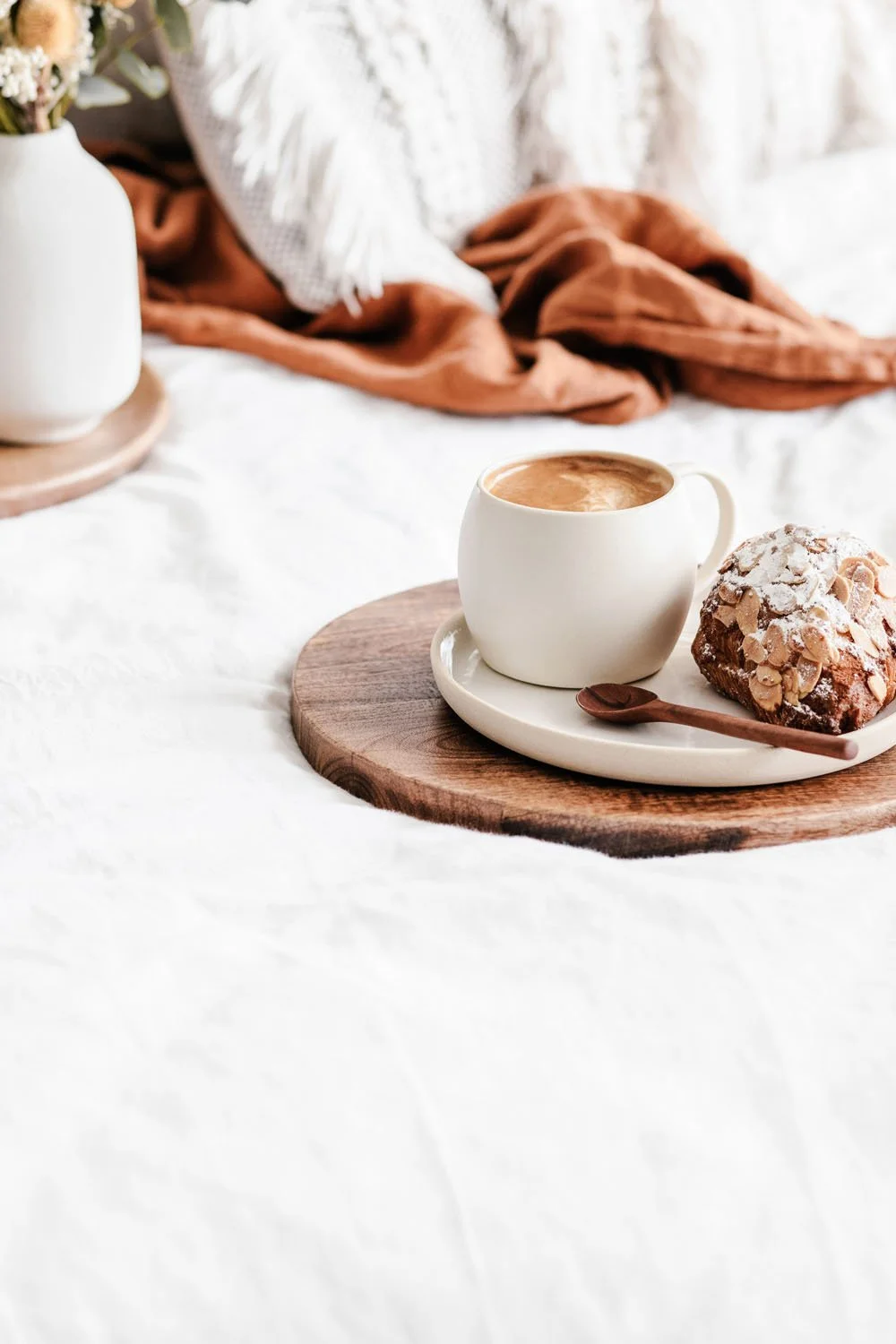
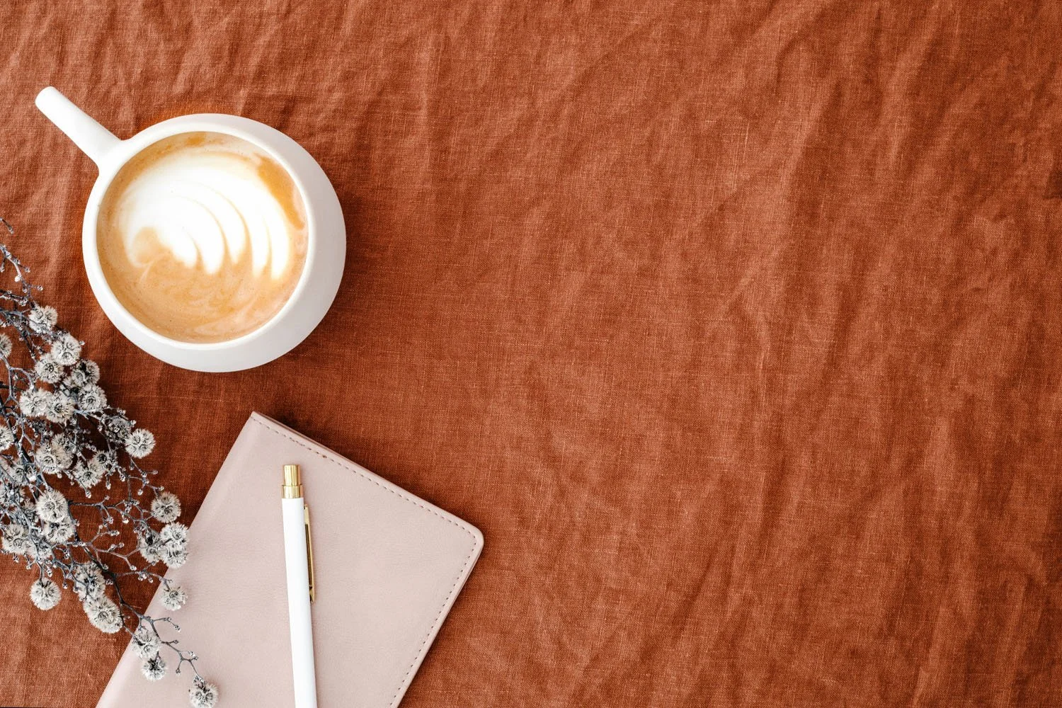
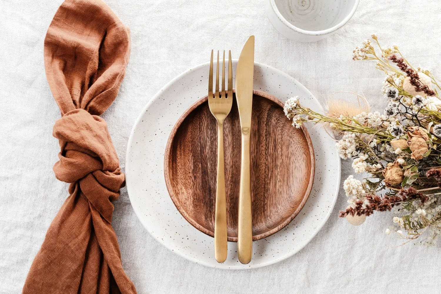
Use a Consistent Colour Palette for your website images
The colour palette you have for your website/ brand is a great starting point for your images. Ideally you want to choose images that pick out at least one of the colour tones from your palette, and certainly do not clash with it.
In some web design projects colours are only/ predominantly introduced via the imagery as opposed to via background or text colours, which makes it even more important to ensure these images have a consistent colour palette.
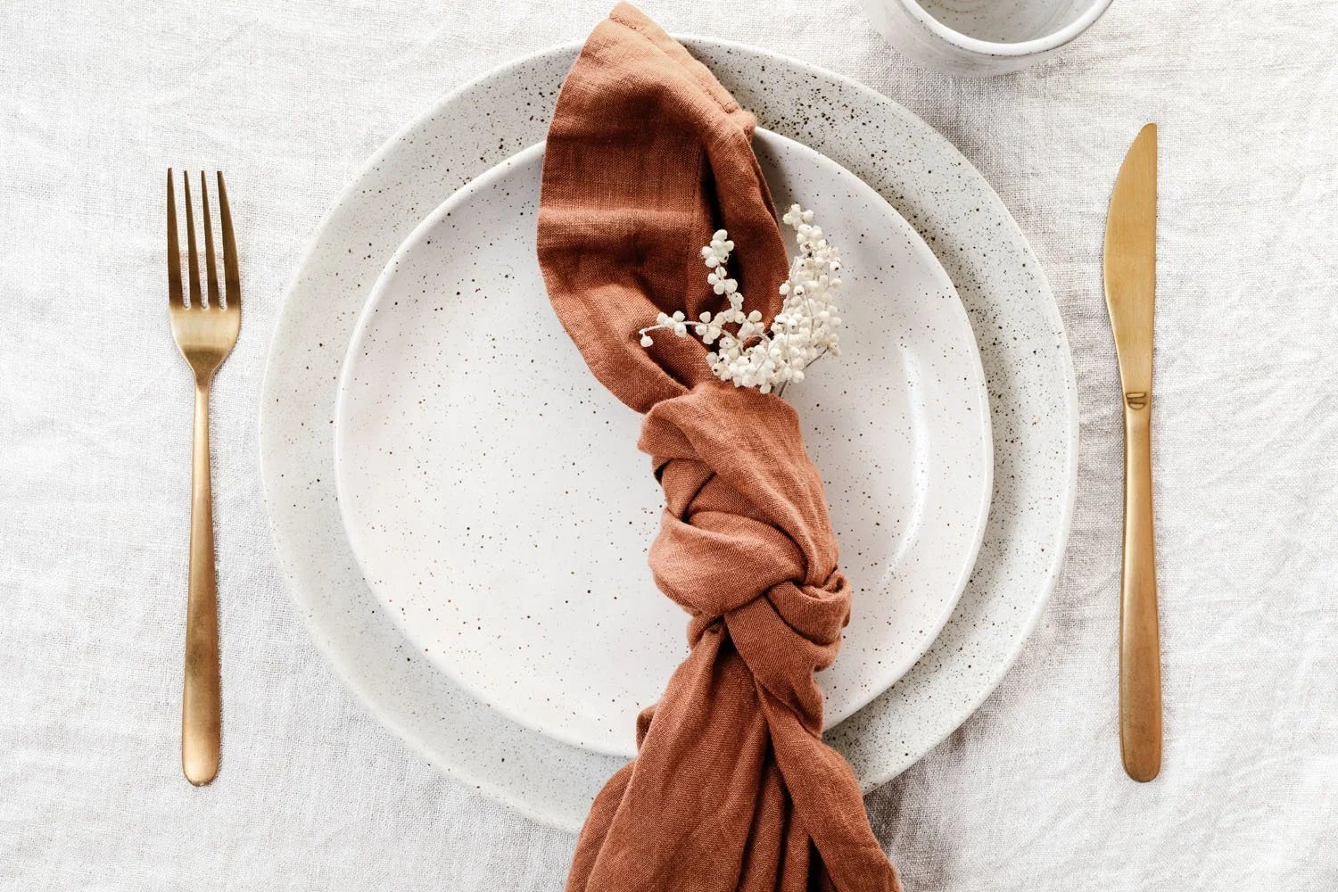
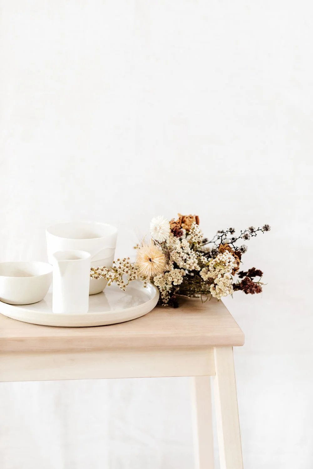
If you’re not sure of which colours to draw from your palette, or your colour palette doesn’t translate easily to your image selection, err on the side of neutral for your images. This allows them to blend in and not clash with your palette whilst being consistent with one another too.
Looking for some gorgeous neutral images - check out Moyo Studio. You can grab 50 free images with this link*. The below images are from their Robyn collection.
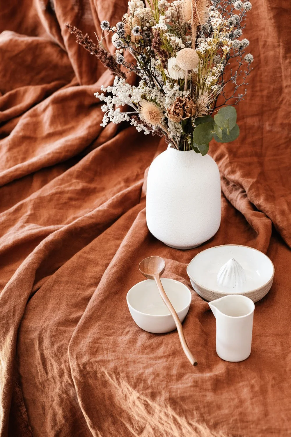
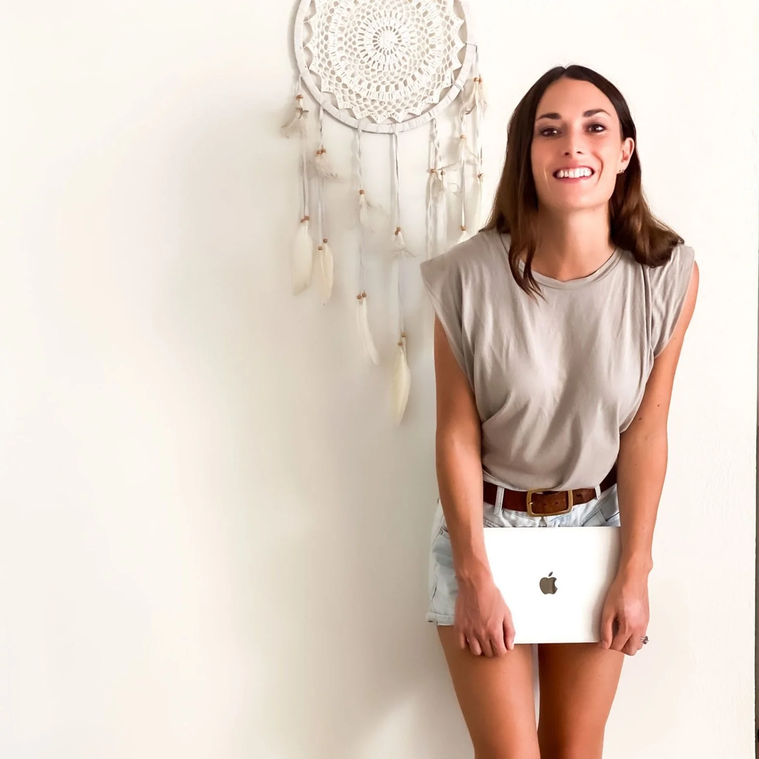
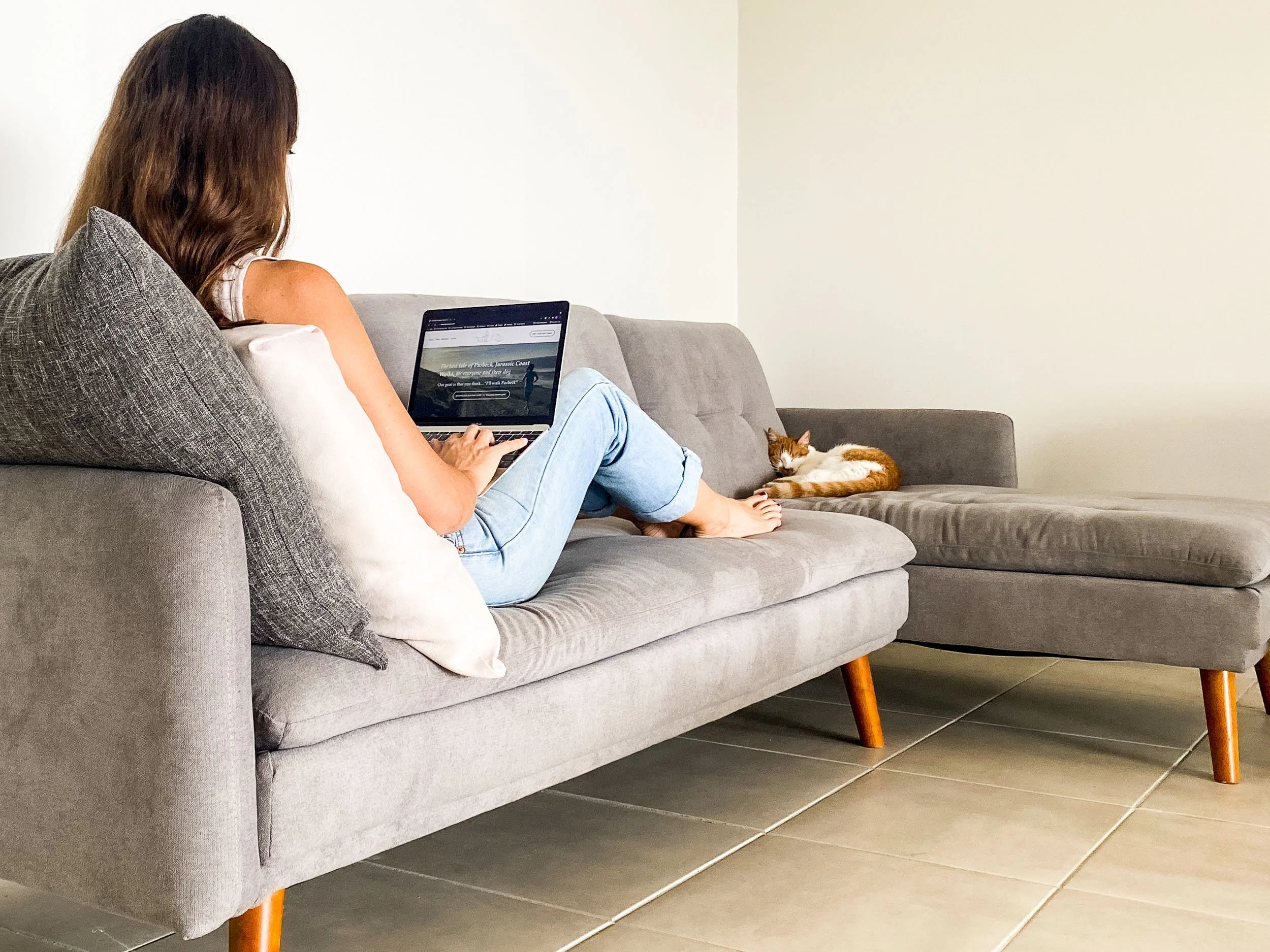
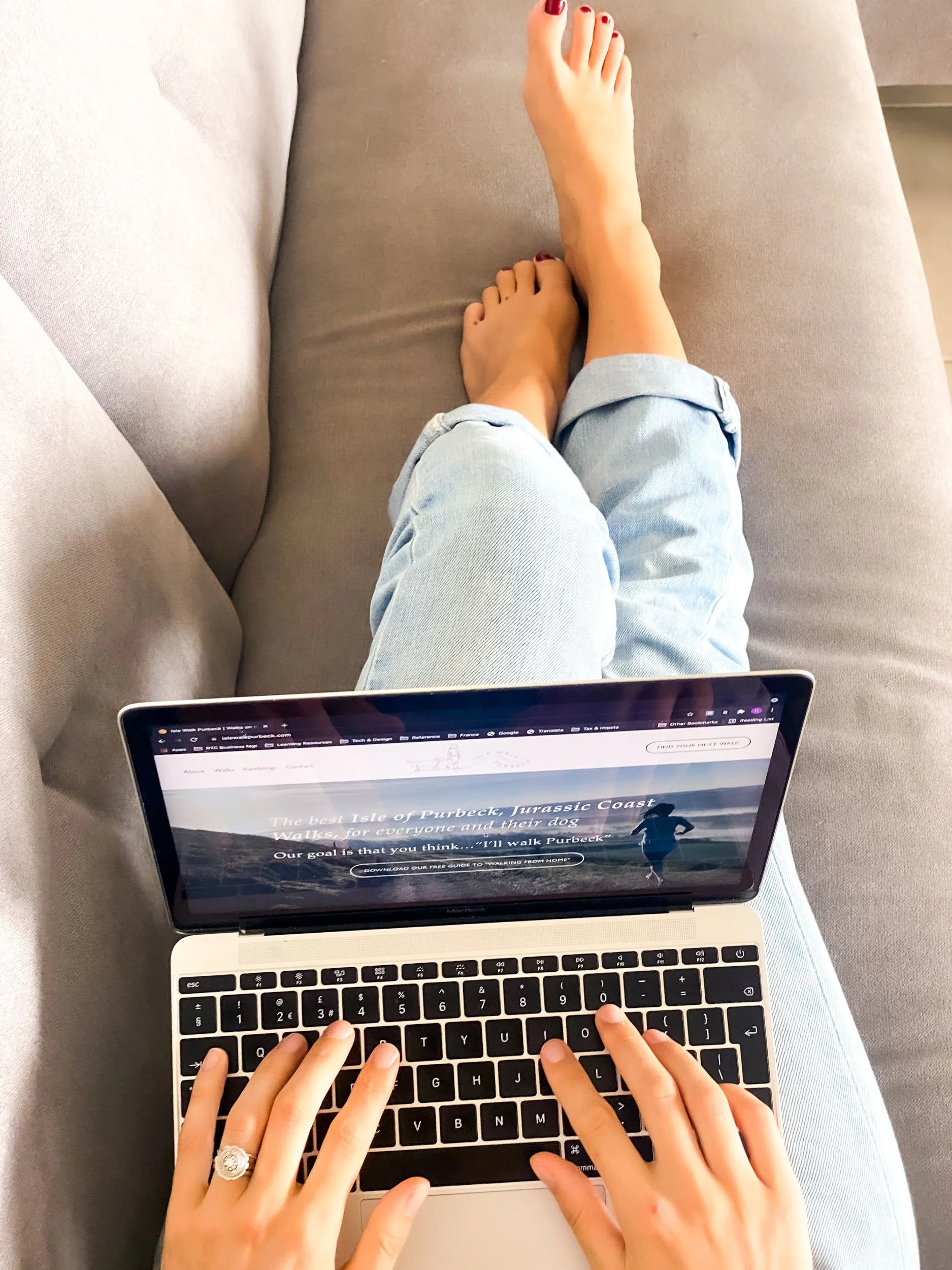
You can also ensure the images you take yourself, or have taken by a pro pick out the main colours from your colour palette and vibe together - like these ones from my DIY website photoshoot.
Select images for your website (not for a photo frame)
Once you have your emotion, colour palette and topics/ subjects, you need to think about image dimensions and structure - specifically around what is required for your website. This is very different to the way in which you might select images for a photo frame or even your social media accounts. Some of the key considerations unique to website image choice are as follows:
White space to allow for text layering over an image
If you plan to layer text over an image, you will need sufficient “white space” to allow you to layer either text and / or a Call to Action button over it in a legible way. Never compromise the readability of your text by layering it over a busy, or low contrast background.
Banner image dimensions
A banner image is an image that fills the full width of your website. These images will need to be landscape (at least 3:2) - don’t use a portrait image for a banner. It’s also common to layer text or a CTA action over a banner image so be conscious of the above point about white space.
Thumbnail image consistency
Thumbnail images are usually in 1:1 (square), 3:4 or 2:3 (landscape) dimensions - although not always, for example my blog thumbnails are in 3:2 (portrait) dimensions. They are often used to represent products or services, or blog posts and will be displayed next to one another, so it’s important they are complementary to each other and a consistent set of dimensions.
Pinterest dimensions
If you’d like to have pinnable images on your website you may wish to use Pinterest (3:2) portrait dimensions. This is particularly relevant to blog post thumbnails.
Sourcing images for your website
Once you’re clear on what images you need, the emotion you’re trying to convey and the dimensions of your images you need to source them. The main ways to source images for your website are
Stock images - see this on some of my favourite free and paid stock photo websites
Professional photoshoot - see this on how to choose a professional photographer for your website (and this on how to prepare for your website photoshoot)
DIY photos - see this on how to take amazing website images yourself!
Before you add your images to your website…
To ensure that after all that hard work on selecting, sourcing and curating images for your website your images look amazing and your website loads quickly don’t forget to make sure you’ve checked out what size images to use for your Squarespace website, and how to resize images if necessary before uploading them.
And a final tip… google can’t “see” your pics, and neither can someone accessing your site via a screen reader - so don’t forget to add a great alt description (it makes your website accessible AND boosts your SEO - win win!)
So there you have it - the complete guide to choosing images for your website.
Loved this? Check out these related posts… and as ever - got questions or want to chat, get in touch!


New on the ‘Gram…