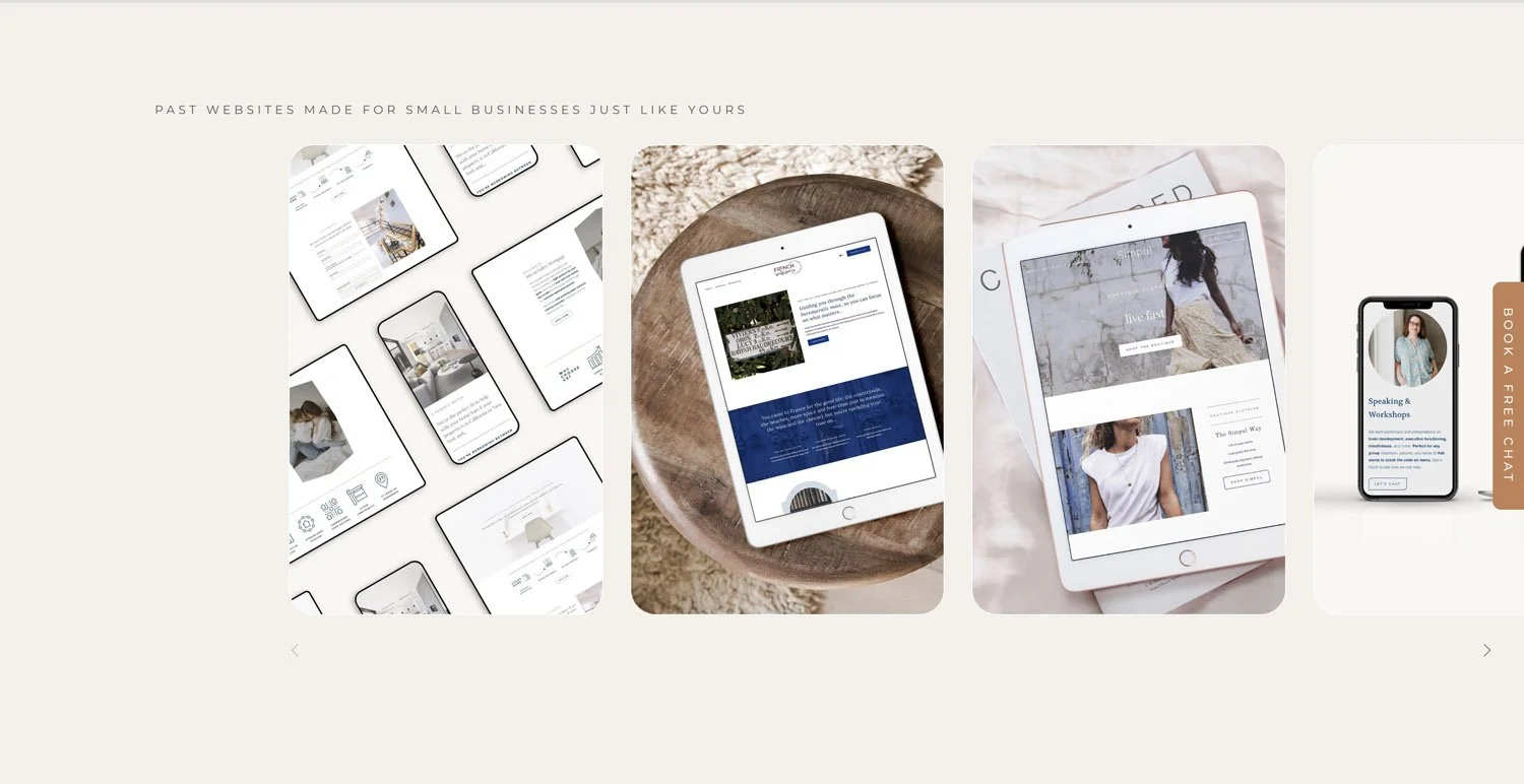
Squarespace hacks - tips & tricks to save you time!

If you’re knee deep in designing your Squarespace, or if you’re a new Squarespace web designer, scratching your head and wondering HTF other designers are offering a website in a day, or a week, when you’re struggling to meet month-long timelines, then these Squarespace Hacks are for you!
When I created my first Squarespace website (back in 2020 for my yoga business) it took me a good six weeks. My first client site took me a month, my second pretty much the same. I kept asking myself how on earth other designers were doing VIP design days and turning out a one-page site, or managing to work these mythical 20 hour weeks, whilst doing a couple of custom sites a month (and earning 6 figures a year whilst they were at it!) What Squarespace Hacks did they know that I didn’t?
I was so worried that clients wouldn’t be happy that I would change tweak & work work work to the point that I was lucky if I was making minimum wage, and had absolutely no chance of doing anything resembling marketing alongside…
Well after a good 50+ Squarespace websites, a flawless set of 5* client reviews (humblebrag ;)) & a huge learning curve, I can confidently say I’m in the ranks of the one-day whizzes (and I feel pretty fabulous about it!) So in the spirit of support & care (the ethos that this biz n blog were built on) here are ten of my top Squarespace Hacks and time saving tips that save me literally hours for each Squarespace site I build.
This post may contain affiliate links. These are denoted by a *. If you make a purchase via one of these links I may get a small kickback. I only recommend products and services I use and love myself! Thanks in advance :)
1. Get clear on your goals & audience first
It likely sounds obvious but one of the most common time-suckers I see is people starting to create their website (or beginning their relationship with a web designer) before being clear on what they want their site to do for their business, and who their audience actually is. It’s not as much a Squarespace hack as a general business hack!
Without knowing these two things, I can guarantee you’re going to have false start after false start because you lack the clarity to make the decisions necessary throughout the web design process (your site will likely suck in the end too!)
The first of my Squarespace hacks is…
Take some time to clarify your ideal client before you do anything.
Who does your business exist for?
What are they driven by?
What do they love?
How do they speak?
How do they make decisions… all of these things are relevant
Grab my free ideal client avatar workbook for a step by step ideal client refining process)
If you need a bit more of a helping hand, make sure to find a web designer who offers coaching or support to get clear on your site goals and ideal client profile before you start the actual web design part of your project.
Web designer tip!
Clarify where your clients are at in the process during the discovery call. If they’re not clear on their ideal client & site goals, either offer coaching first to support them (I do this at an hourly or package rate), or kindly recommend they do this work first before you start your project together (it’ll save you hours in changes of brief or an unhappy client at the end of the process!) W
2. Get your content sorted Before you start building your Squarespace website
Designing a site around the content you have, as opposed to adding in dribs and drabs throughout the process makes building a site a million times quicker - this is the second of my Squarespace Hacks. If you’re creating your own Squarespace website, this requires a bit of discipline, but try to write your copy, gather your images and make sure you have basic visual branding (colours & fonts in particular) before you even start your website.
Need a hand?
Grab my website page content templates for your Homepage, About Page, Contact Page & Blog to get you on your way.
Web designer tip!
Firstly - hold yourself to the same standard as your clients & when working on your own site, get your content sorted first (harder than you think haha!)
Secondly - make sure that your clients having their content ready, and in the format you prefer at least one week before the website project begins is written in black & white in your contract. Also make sure you discuss this on your discovery call, include it in your client welcome email (and pack), and any FAQs you provide. Make sure to automate sending reminders too!
Finally - build in time to check your client’s content as soon as they submit it so you can go back to them with any questions, clarifications or issues well before your project starts which gives them time to action changes & gives you the best possible chance of having fabulous content to build the website from.
3. Batch organize, compress & upload your images (This is my fave of my squarespace hacks)
With pre-provided content comes the chance to save some serious time processing, optimising & naming your images (this saves sooo much time I can’t even tell you, hence making it my fave of all the Squarespace Hacks I’m sharing today)!
Here’s the step by step guide (a la Rising Tide Creatives!)
Start by choosing a range of fabulous images for your website - either by doing your own photoshoot, hiring a photographer, curating a beautiful range of the perfect stock photos or a mixture of the three.
Now re-name all of your photos using the words you’d use for your alt image descriptions (this will save you loads of time later!)
If you have groups of images, eg for specific pages, or specific product/ portfolio items, split them into folders using these groupings, otherwise pop them all in one folder
Now’s time to get compressing. You’ll want your images to be no bigger than 500kb (smaller if possible) and to be 1500px wide - here’s how to compress your images for your Squarespace site.
To make uploading your images to your site quick n easy we’re going to use the assets panel to upload them in batches. Here you have a choice - if you don’t have a tonne of images you might just want to upload them all together. If you do have loads, use the folder functionality to organise them to help save time later!
Now this image resizing checklist is one thing - but checklists in general are fabulous timesavers & mistake catchers - this should have been on the list of Squarespace Hacks on its own! Grab your free launch checklist here to save time & stress when it comes to launching, or relaunching your site.
4. Start from a scratch (but with a site template) Oh actually this is my fave of the squarespace hacks (haha - maybe they’re all my faves!)
OK so this fourth of my Squarespace Hacks sounds like a contradiction in terms, but bear with me - it’s a game changer.
I start all my custom client site designs from scratch (I’m not using a ready-designed template & just adding content to it). BUT those blank sites that I start with are actually duplicated from a base site that has the following things set up in it:
All the main pages & urls for them (Home, About, Contact etc etc) plus the “back end pages” like policies etc
A site styles page that I use for making design decisions already built out in the base site (I’ll come to this later)
CSS snippets I use in every website (smooth scroll, centering text on mobile, color code shortcuts etc)
Universal filter plug in installed in the blog
Footer with site map & all the legal links already connected
And… drum roll, a client support super page with links to a tonne of how to guides, tutorials & supporting materials to make the transition easy when they take on their site themselves.
Having this embedded in the base site I duplicate saves me a tonne of time & gives them super simple, easy access to their own client base within their site after handover.
5. Pre-create a CSS snippets bank
Once you’ve created a couple of sites you’ll start to realise you have your go-to CSS snippets that you use time and time again. This is one of the Squarespace hacks that saves me the most time and is a great one if you’re designing more than one website!
For example I consistently add:
Smooth scroll (great for hopping to anchor links)
Centering buttons & making them the same width on mobile (your UX will thank you for it!)
Blog summary block styling
And more you can find on my 21+ favourite Free Squarespace plugins
And although I can write these out from scratch every time… why would I?
It’s much quicker to have them in a bank of CSS snippets & copy & paste them in, then change the necessary bits n bobs to style them for that particular site.
Or, one better, add them to your base template, then they’re automatically added to every site you create.
You can then easily delete the ones you don’t use (or simply wrap them with a slash and stars either side which disables them - you’ll notice coz they turn grey /** **/) and voila - you’ll save a good chunk of time adding & fiddling with code)
6. Create a Squarespace styles page (& use it to set everything first)
So, that site styles page I mentioned in number 4 of my Squarespace Hacks - what am I talking about?
Put simply a Squarespace site styles page is allll of the different block types you find on Squarespace, multiplied by all of the different section color themes all on one page.
(Here’s an example of a couple of parts of the page - you can see it’s a beast!)


Why do you need a squarespace site styles page?
Because this way you have a way to see, in one place, everything that’ll show up on your site, and you can use it to set your color palette, fonts & font styling, button styles and check how everything looks in each color theme (meaning that if you need to make any manual tweaks you can do so easily, before you start actually building your site.
This saves so much time when you’re building your Squarespace site because you set everything in one go, as opposed to little by little throughout the build, you look at and think of all your styles holistically (like do these fonts work together, is there enough contrast between these colours etc) which saves a huge amount of time doing & redoing this later on.
And the cherry on the cake of the fifth of my Squarespace Hacks?
You can also use this for writing and applying any CSS, allowing you to see how your CSS effects elements & creating specific styling for your site, before you actually start the build out (a great way to write CSS in a much more streamlined way and to avoid adding CSS that unexpectedly effects another element without you expecting it).
I (maybe controversially) don’t create wireframes and site mock ups before designing (I legit find it just as fast to design directly on Squarespace) but I don’t skip this step, because everything else flows from it!
7. Keep it simple (Nope - this is the squarespace hack to rule all squarespace hacks!)
One thing first time DIYers and less experienced Squarespace designers (myself included at the beginning) seem to do without fail is overcomplicate things. And to be frank, I think this is one of the biggest reasons sites end up unfinished, overly time consuming & stressful.
Let me explain.
It’s pretty much human nature to want to stand out, be different & do something a bit special with your website. You might have been dreaming about it for a long time, and now it’s time to build it, well, you’re ready to create something unique!
Except… (and bear with me here)
Unique sites don’t help you book clients, or sell your products or services. They might look flashy, but they’re usually not strategic, and ultimately not very effective.
Think about it like this, you’ve probably been on a good few websites today, including this one. And you probably had a decent idea of what you were looking for - a blog post to help you to save time on Squarespace, or cook the perfect carrot cake, a product you wanted to buy & reviews about it to check you’re spending your money wisely, knowing how to get in touch with that painter you’d like to decorate your new kitchen, the opening hours and menu of that new restaurant that’s opened up downtown.
You weren’t looking to be wowed by things whizzing around the place, or a unique take on a navigation.
You were looking to quickly find some information, make contact or spend your money.
Now that’s not to say your site shouldn’t be professional, beautiful and on brand. And it should of course build trust & a relationship with browsers.
But it should also be simple. Things should be easy to find.
This is the best of the Squarespace Hacks because everyone - you, your visitors, the internet in general… everyone wins!
Design conventions exist for a reason - we know that the menu is normally to be found in the top right, that when you click the logo you go back to the homepage, that in the footer you can likely find contact details, that reviews live next to where you can purchase a product. That means we’re not using brain space to figure out how to find what we need, we know already & we can concentrate on the actual content of the site (the stuff you want your visitors to engage with).
Put another way, I’m ready to bet you’ve peaced-out of a site before because you can’t find what you’re looking for, so you went elsewhere.
So think of your site through your visitors eyes - keep it simple, streamlined & easy to navigate through. Don’t go wild with “cutting edge innovation”. Not only will it save you time, it’ll also give you a more effective site in the end.
8. Design once & re-use
Another way to think about keeping it simple is to use several section designs on repeat. Something I see super commonly on DIYed sites is every site section, and page having a different color scheme and design, because clearly the dedicated & thoughtful business owner behind the site wanted to create something incredible, and that meant 40 unique section designs…
Thing is, not only does this tend to confuse people (see section 7 on simplicity - the simpler the design the easier the info is to find & process), it also tends to look messy, and much less cohesive. It also takes AGES! So number 8 in the list of Squarespace hacks is…
…instead of creating a different design for every section on your site, consider creating 5-7 designs and reusing them.
Ideas might include…

Your above the fold section design (the top section on each page) Here’s mine!
An options section design (great for displaying service options) Here’s mine!
A process section design (great for showing steps for working with you/ the process you use to create your product or even your values) Here’s mine!
Here’s another process/ text based section design example

A text based section design (great for a mini about section, or a space to explain more about something) Here’s mine!
An image/ gallery section design (great for showing off visuals - this could be your team, or mock ups of your product, or food in your restaurant, or examples of your photography or whatever you like) Here’s mine!

A freebie/ opt in gift section (here’s mine!)
By creating a set of section designs that can be used in various combinations on various pages of your site, you’ve massively simplified & sped up your design process, as well as allowing yourself to spend more time on getting these designs right, making them look beautiful & bang on brand, and applying CSS to their specific classes if needed.
The actual building out of your site from here is then super mega easy!
9. Create and use saved sections
Especially because each of these section designs can be set as a saved section on Squarespace, meaning that with just the click of a button you can add them to any page simply and easily (it’s honestly the very best Squarespace functionality IMHO!)
To create and use a saves section, simply finish your base section template (make sure to also style it for mobile & tablet so it looks great on all device sizes).
Then click the heart shaped button to add it to your saved sections.

Go to the page that you’d like to add your section into and click the add section button. Choose saved sections and click the one you want to use. Voila! As simple as that.


Then tweak as needed to fit the context!
Pro tip - design all your section templates on one page, and check how they work together by switching up the order & seeing how they fit. Do all your styling (mobile and tablet) for each section, and once you’re happy save them all to your saved sections. This way they’re all there in one place and you can easily add them to any page you’re working on with the click of a button.
Oh and to pass number 9 in the list of Squarespace Hacks onto your clients, teach them how to use saved sections too - they’ll thank you for it!!
10. The last of my Squarespace Hacks… Streamline your feedback
OK, this isn’t really a Squarespace Hack, but a general web design & working with people timesaver! It’s especially for the designers out there (but TBH if you’re working with a designer, or getting/ giving feedback on your site from a colleague, or friend this is defs useful).
Streamline the feedback you gather on your Squarespace site. And streamline it’s implementation too.
At the beginning of my biz, I’d accept what I called “unlimited amends” on site designs. I’d seen others doing it and thought it sounded client centric & wonderful.
Problem is, it meant that the final days of any project were an absolute nightmare. I’d be receiving emails with bits n bobs (a typo here, a color change there, a bit of spacing in the footer) then trying to keep track of them as I did them. This meant doing the other things I had to do to finish off the site (image alt descriptions, meta descriptions, link checking etc) was super interrupted and took way too long too. I couldn’t wait for my projects to end!
Over the last few years i’ve completely changed things up and although I don’t put a limit on amends) I do have a very streamlined way to manage it & also love another couple of approaches I’ve seen, so here’s how I suggest you do it.
Put whatever your approach to feedback/ amends is in your contract, FAQs and mention it in your discovery & onboarding calls & information packs. Set your boundaries very clearly so that your client is in the know and comfortable with your approach (regardless of your actual method this is key!)
Designer Tip: Consider turning down clients where they’ll need multiple points of feedback or sign off from a leadership team or board (and if you do take these on, make sure to be clear that all decision makers need to be on the call OR one person needs to collect the information from everyone & input it in the pre-defined opportunities). Trust me, you’ll save yourself a headache or three!
Consider doing live amends.
This is my preferred method. I give my clients access to their site a day or couple of days before they’re due to give input. We then jump on a live call & I make the changes/ amends whilst they watch on screen share.
Why do I love this approach?
It avoids misunderstandings
Clients can see the impact of their feedback & whether they like it immediately (and we can change it back or find an alternative solution if they don’t like it)
I can explain why a certain change might not be a good idea from a site strategy or design perspective.
Feedback is boundaried & I have time set aside for it. Our call runs for 60 minutes and almost always all feedback is given & acted on in this time. If their feedback requires something more complicated (like some custom CSS that I can’t do on the call) I have some time blocked after the call to finish things up.
I do 2 calls like this during most custom builds, one to review the homepage (for overall design & style), and the second to review the whole site. We tend to have a 3rd call right at the end for snagging (any minor issues picked up during testing) but larger design changes are off-limits for this final call.
You might be wondering, what happens if they have too much feedback to do on the call?
This really rarely happens coz I really focus on listening & getting the brief right at the beginning, and check in on design style for the first round of feedback. But if it does, what’s good about the live feedback approach is that clients can see the changes and how long they take, and so have a better understanding of the impact of what they’re asking for. I’m always willing to pop in one additional call if needed (it’s an hour of my time, which I factor in to my projects & use on other site optimisations if it’s not needed). In the worst case scenario if feedback from a client pushes the project timeline, I let them know in the initial project set up & contract that it’s payable at an hourly rate so there are no nasty surprises (happily I’ve rarely, if ever experienced this!)
The thought of live feedback bring you up in hives?
Recorded feedback might be more your jam…
Recorded feedback rounds.
Loom is a fantastic tool for you to ask clients to use to give feedback, and for you to respond with. They can go through their site page by page & show you the changes they’d like to see, explaining them and pointing out issues. I love using this in combination with markup.io also available as a super simple to use chrome extension which makes it easy for clients to write comments on the specific part of a page they’d like to give feedback on simply by clicking on it and adding a comment. It also integrates with Loom and they can attach images making it so much easier for them to give you clear and easy to interpret feedback.
If you choose to do recorded feedback rounds, I’d recommend setting a certain number of them with clear deadlines & not accepting feedback in between or after these to allow you to batch reviewing & implementing changes.
So as well as Squarespace Hacks, I’ve started collecting Web Designer Hacks - make sure to let me know if you’d like to see a blog on that soon!
So there you go - 10 Squarespace Hacks, Tips & Tricks to save you time on your website builds!
Got questions about how to implement any of these time saving suggestions and Squarespace Hacks? Drop me a note helen@risingtidecreatives.com. I read & respond to every single email & I love love love hearing from you!!
Oh & if you enjoyed this post - make sure to sign up below to get ones just like it, straight to your inbox.