Website Colour Palette - 5 simple steps for choosing and using colours on your website
Let me guess, you started DIY-ing your website, gathering visual inspiration from Pinterest and Instagram decided on your colours, popped them in and felt a rising sense of panic because it just … didn't… look… like… the … moodboard.
Or perhaps you didn't make it that far, and are stuck scrolling through endless options and just can’t see the woods from the trees.
You’d be right to consider that choosing your website colour palette is an important decision - with 62-85% of purchase decisions being heavily influenced by colour, and those decisions being made in the first 90 seconds, getting your colour palette right is crucial to the success of your website.
Happily it doesn’t need to be as overwhelming as you first thought. Here’s my easy step by step guide to choosing and using colours on your website.
Understand your customer and market
As with every decision relating to your website - copy, image selection and overall design included, the key driver is your ideal website visitor. More specifically…
What colours your ideal website visitors are drawn to
Research shows that for colour preferences it’s different strokes for different folks - more specifically - different genders and different age groups have different colour preferences. Thing is, most articles talk about this in very broad terms - i.e. Men vs Women, the 65-80 age group vs 21-30 year olds. Not super useful (unless you consider yourself to be the same as all over 36 year old women… I don’t).
To understand the colour preferences of your ideal client I’d go further and consider your ideal client in much more detail. A great way to do this is to identify a list of brands that they use and love and identify similarities in those brand colour palettes. And not just the colours themselves, but also the tone and shade. Is it mostly pastels, neon, deep or muted that they seem to be drawn to in other brands? In many cases this is just as important as the colour itself.
Not sure who your ideal client is? Grab this free workbook to help you get clarity (it’s legit one of the most valuable exercises you can do for your biz & this workbook has everything you need to make it super simple!)
What feelings and emotions you want your visitor to experience (that are similar or related to how your product or service will impact them or that echo the emotion they feel now)
It’s probably not news to you, but colours provoke emotions. They also carry cultural and societal context. Red = alert, wrong, danger, Green = go, correct, nature and so on (if you’re interested in more about this have a read of this article on colour psychology).
This is really useful to have a sense of when you’re considering your colour palette, however once again I’d go further.
As you well know - there is not just one shade of blue. From duck egg, to sky, to the lightest baby blue and all the way to deep, dark almost black, navy. You can’t tell me that all of those blues provoke the same emotion, nor carry with them the same cultural or societal symbolism.
So similarly to when you were considering your ideal client, consider this question a little more deeply than simply colour psychology in the red vs. blue category, but what shades or tones of colour you want to use on your website and how they might provoke emotion in your visitors.
In addition to this, consider whether you’re seeking to change an emotion or feeling, or engage/ reinforce an emotion or feeling that already exists in your visitors. Obvious examples of this might be a spa trying to evoke a sense of calm in people that don’t yet feel calm, or even conversely feel stressed, or a children’s centre emphasising the emotion of playfulness and joy in people who are already feeling joyful (Feeling a little lost here - keep reading to the example at the bottom of this section)
What colour palettes your competitors and others in your sector are using on their websites
And do you want to stand out or fit in?
There are certain sectors that have very strong overriding colour trends. For example the legal sector commonly uses royal blue and gold in it’s branding (type in legal firm colour palette into Pinterest and you’ll see this confirmed!), communicating a sense of tradition and prestige. Medical brands often use turquoise or shades in the blue-green spectrum with lots of white to communicate a sense of cleanliness and calm.
How to choose a colour palette based on your sector
Here you have a couple of things to consider - in your sector, is there an overwhelming colour preference that people strongly associate with that sector? Do you want to fit in or stand out? Another thing to consider is if you provide B2B (business to business) services to a particular sector, do you want to echo their colour palette themes in your own (e.g. a web designer for lawyers using blues and golds in their own branding).
Website Colour Palette example
Let’s consider an example to help us make more sense of choosing our colour palette based on customer and market (this one is a real life brand and website project I recently completed).
Alan is a mortgage broker, his clients range in age from 30s to 70s and are a mixture of men and women. He serves borrowers in New York & California, and wants to expand his reach into a market of borrowers with bigger budgets.
Finance firms often use blue in their colour palettes regularly paired with grey - a commonly used colour in financial firms - connotations of being serious with grey suits etc along with red that is a powerful eye catching and action taking colour and gold that evokes a sense of prestige and wealth.
Holding this in mind, along with the wide range of clientele (all who have one thing in common - all wanting a complex and scary process to be simple and safe). We decided to stick with blue as the primary colour in the palette but instead of either a bright mass-mortgage blue, or a deep “safe” navy, to go with a soft blue gradient, evoking thoughts of water and calm. The website colour palette to compliment the primary colour blue was made up of beige, white and dark grey. Colours that when placed together give a sense of calm, order, but also due to the tones and imagery we used felt warm and soothing. We wanted to achieve a calming, peaceful, measured and warm feeling and so steered clear of red which is a stimulating, action focussed and provocative colour.
Case in point on how this impacted website visitors - during testing a direct quote was “this website makes me feel calm even though mortgages is a topic that makes me feel very not calm” a good example of how colour selection and design can communicate as (if not more) powerfully than words.
2. Keep your website colour selection simple
You might feel you need a tonne of colours in your website colour palette - you might be drawn to loads of different colours or think that you need lots of options for different website sections. Consider this me saving you from yourself ! You absolutely do not need loads of colours in your website colour palette.
The way I like to think of it is 3 main colours with 2 in the supporting act (so a maximum of 5) although 3 can work very well… even 2 in some cases.
I start with one colour (see the above section which might help you choose this) and then build the rest of the website colour palette around it.
In your 3 most important colours you will need the following players:
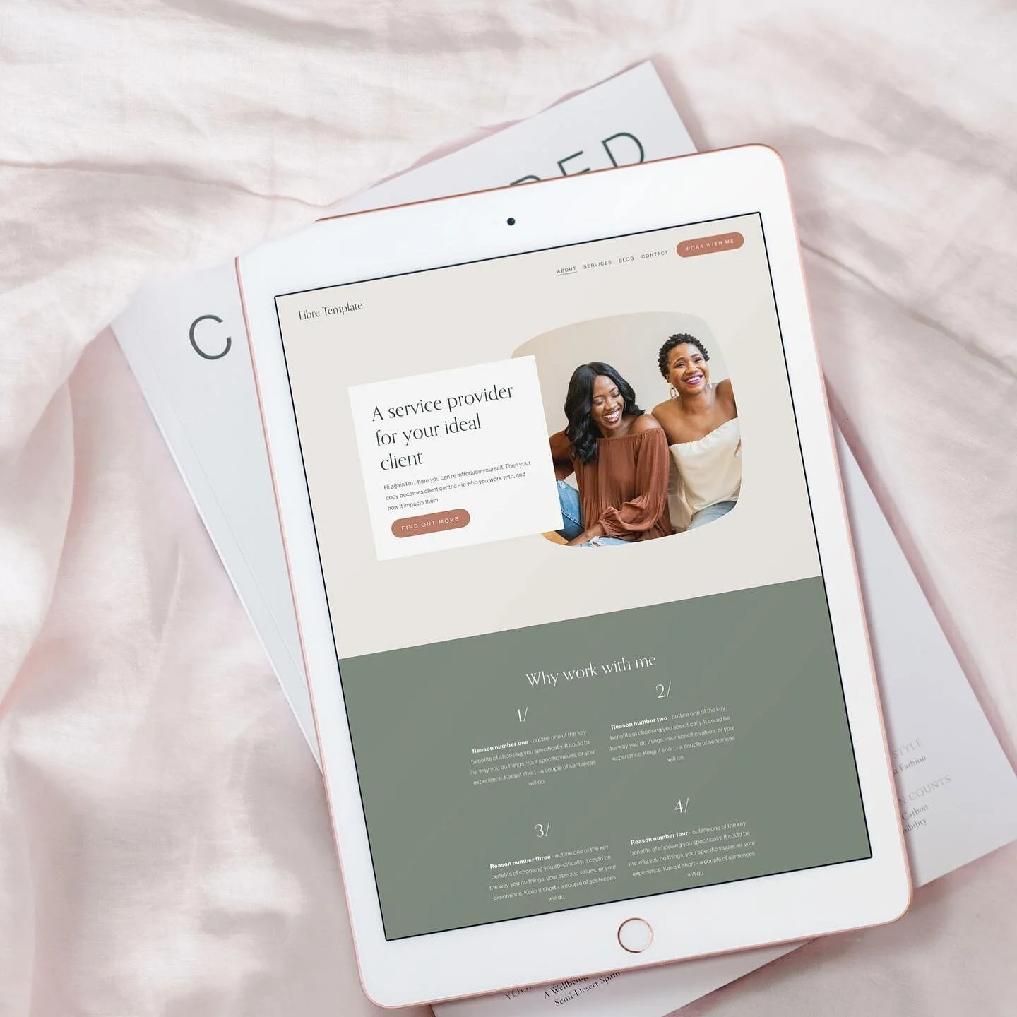
1 light colour. Think website background. This light colour is the canvas for your text, images and other website wizardry. This colour should be light enough that your text (in your dark colour) contrasts well and is readable when on top of it. If your primary colour is already light enough to use as a background, you can replace this colour with a dark or medium colour if you want.
1 dark colour. Think text. We will talk about accessibility in some more depth shortly, but generally it’s good practice on a website to have one dark colour that can be used as your text colour over a light background, with a good contrast between them. If your main colour is dark enough to use as text you can choose a medium or light colour in the place of this dark colour.
NOTE: You might invert your colours and have light text on your dark background although always check for accessibility as this can sometimes be harder for people to read.
Now you have your 3 main colours you can select up to 2 additional colours to support them. Here are my recommendations for how to choose your additional colours (and remember they are not 100% necessary - your 3 main colours may be enough).
Different shade(s) of your primary colour. If your primary colour is very “poppy” you might find a toned down version of it allows you to use it more flexibly in graphics, frames or even as an alternative background colour.
Another light/ neutral. You may wish to give yourself more options in the white/ neutral space to have a variety of background colours you can use, slight variations on the neutral or light colour theme can be really effective when paired together in backgrounds.
A complete contrast. You might want to go wild and add in a colour that totally pops against your existing palette. Maybe a complete contrast to your primary colour, giving you a way to highlight and call attention to CTA buttons or certain sections. Use one of the colour palette tools below to identify contrasting colours that work well with your primary colour by using the colour wheel.
Need some help finding colours that compliment your primary colour? You might find these tools useful.
Colour Palette Tools
Adobe Color - my favourite colour palette tool, adobe color is a free resource from adobe that includes colour theory to help you choose complimentary colours as well as a huge bank of existing colour palettes to draw inspiration from. You can also upload images to extract colours from and make use of their accessibility tool to check your colour contrasts (more on this below).
Coolors - generate colour palettes, find complementary shades, extract colours from an image. Save and share palettes. You have loads of options with Coolors.
Huesnap - a great tool that takes an image you’ve taken and extracts the key colours to create a palette (make sure to still follow the guidelines above when choosing the colours you’ll use).
Canva colour palette generator - Canva is a great free tool that makes basic graphic creation available to anyone. In fact for my branding packages although I create using the adobe suite I provide editable versions of things like social media graphics for clients to edit in Canva. The Canva colour palette generator is one of the fab free tools you can access and allows you to extract a colour from an image as well as browsing pre-made colour palettes for inspiration.
Material design palette - is a simple tool that you can use to create a colour palette by selecting 2 colours, it then builds the rest around it. The downside is that you have limited options for shades and tones, but it is super simple to use.
3. Identify HOW you plan to use your colour palette on your website
This step is really a parallel step to the previous section. One big thing people miss is thinking about HOW they will apply their colour palette to their website, or phrased differently - what aspects of their website the different colours will be used for. This is often where the “lost in translation” moment comes between finding the perfect inspiration colour palette and applying it effectively to a website.
Here it can be useful to answer the following questions:
What colour will your header/ footer be?
What colour will your titles be vs your paragraph text (if different)?
What colour backgrounds will you use?
What colour will you use to signify hyperlinks?
What colour will your CTA (call to action) buttons be?
These aspects should be pulled from your colour palette.
Squarespace makes this very easy and auto-generates section themes using your colours - however to make sure you don’t end up in a pickle with this make sure you read all the way to the bottom and grab the bonus tip on how to set up your website colour palette in Squarespace as it’s easy to end up with some ugly colour combinations !!
Even if you’re using Squarespace I recommend you test your colour palette by mapping out a couple of different section “themes” and check they work with your chosen colour palette. Again remember you don’t need to go wild and have loads of different variations. 1-3 will be just fine.
My top tips here are:
Stick to one colour for your CTA buttons throughout your website if possible. People like familiarity and this helps. (An exception to this is if you have a priority CTA that you want to stand out from the rest - you may wish to use a contrasting colour for this so it pops and draws the eye and the clicks!)
Ensure text and background always have a strong contrast - no light on light, or dark on dark. See the next section for more accessibility tips.
Avoid black on white (go for black on off-white if you must use black) or white on black (use white on dark grey/ brown or another dark shade) if you must use white text. See the next section for why and accessibility tips.
Choose your header and footer colours carefully as they show on every page of your website.
If you plan to use text over images check that your chosen text colours contrast enough with your chosen images (and if not use an “image overlay” in your contrasting colour to help make sure your text is legible).
Generally speaking avoiding text over images or busy backgrounds is advisable for accessibility reasons.
4. Choose your website colour palette with accessibility in mind
What is website accessibility?
Accessibility means designing for a website with the goal of making the website information and experience available to the widest range of people possible, including people with varying requirements when it comes to accessing information - these could be visual, auditory, motor or cognitive ability. When thinking about colours we’re especially concerned by accessibility for people with visual impairments.
What do we need to consider for website accessibility?
We need to consider accessibility when we select fonts, add images and crucially when we select and use colours on our website. The below points relate both to the choosing of your colour palette, but also to how it’s ultimately applied on your website.
How to choose colours for website accessibility
For accessibility when it comes to colour we need to consider several main factors:
1. Colour Contrast for text
The web content accessibility guidelines provide a ratio to use when assessing readability of text on background colours - they have an acceptable standard and the AAA or enhanced standard. Where possible we should be looking to use the enhanced standard for maximum accessibility. This has been embedded into an easy to use tool by Adobe where you can check what ratio your colour contrast is and adjust as required.
2. Colour Contrast for Colour blindness
Colour contrast is not the only thing to consider with colour palette accessibility, we also need to be aware of how our colour palette appears to those with colour blindness and to ensure that it still has a good enough contrast and is accessible. You may not know that there are a number of different types of colour blindness, and we should ensure our colour palette choice allows our website to be accessible to people who might have any one of these types of colour blindness.
Once again, internet to the rescue! There are a number of useful tools to either review your colour palette and/or your existing website through the lens of someone with one of these types of colour blindness. Here are some of my favourites:
3. Colour for interactive elements
Interactive elements are things like hyperlinks, or icons that are clickable. Watch out for using only colour to distinguish these, make sure to also use something like an underline, low-light or bolded text for hyperlinks and for icons make sure they have another visual clue, as opposed to simply colour (e.g. not just green for yes and red for no, but green tick for yes and red cross for no)
4. Using colours for Dyslexia
There are a few things to take into account when it comes to your colour palette to make your website as accessible as possible for Dyslexic visitors.
As a general rule avoid bright white backgrounds, and certainly black on white. Go for an off-white, or “off black” instead (ensuring you maintain a good contrast).
Avoid patterned backgrounds, instead using plain block colours, and avoid layering text over images.
Where possible use dark text on light (not stark white) backgrounds. Research suggests warm shades for backgrounds - cream, light peach, yellow are better for Dyslexic visitors than cool shades (light grey, blue etc)
When considering colour contrast in general and colour contrast for Dyslexic visitors be mindful that there is a balance, research suggests avoiding the maximum contrast (black & white) is better for Dyslexic readers, however we must still ensure a sufficient contrast between text and background.
5. Use your images to introduce and reinforce your colour palette choice
One of my favourite ways to use my colour palette in my website design is to select images that include key colours from the palette. In some designs I don’t use certain colours from the colour palette in the text, backgrounds, buttons or icons and simply introduce them via the photos I use.
Some great ways to do this could include:
Choosing a colour from your palette for a shirt or sweater in a photo shoot
Using a background (wall, garden etc) that has a colour or colours from your colour palette in it
Using stock images that have a consistent colour palette (I love Moyo Studio* for mock ups and series of stock images built around a palette)
Or use your colour palette to search for images that include the same shade(s) using this tool from TinEye
Whether you’re using your colour palette for elements in your website or introducing colours via your images I always recommend selecting your images to vibe with your colour palette and each other - see this blog post for my step by step guide on choosing images for your website.
Examples of a set of images that pick up the key colours from a colour palette (these are from the wonderful Moyo Studio)*
Bonus tip: How to set up your colour palette in Squarespace to optimise the style setting options
And a new useful workaround for text colours that will make your life easy peasy!
How to add or change your website colour palette in Squarespace
If your website is built in Squarespace (or you’re building your website in Squarespace) adding or changing your website colours is really easy (remember that changing your colours here changes them all over your website).
Navigate to the style menu, either via design or clicking the paintbrush icon in the top right hand corner when you’re editing a page.
Click on colours.
Click on edit palette.
Here you can add up to 5 colours via their hex code, RGB code or HSL code.
Click done on the top left side of the page to save your changes.
How to organise your colours in Squarespace
Squarespace automatically sets black and white, and then uses the 3 other colours - dark, light and accent, however you can override and add 5 colours of your choice to create your own palette. It is useful however to know the best way to set up your colour palette in squarespace to avoid ugly or unusable section themes being created.
This article on colour palettes from Squarespace explains how the section themes are created is incredibly useful in making sense of where you should put each of your colours.
A good rule of thumb is to work from the outside in - the leftmost colour “white or lightest” will be paired with the right most colour “black/darkest” and the second to right colour “dark” to create text and background contrast.
Then the second to left “light” will be paired with the right most “black or darkest” for background and text.
The second to right “dark” will be paired with both “white or lightest” for background and text.
So essentially it’s important to check that there is sufficient contrast between your darkest colour colours and your two light colours, and your lightest colour and the two dark colour. Of course you can use the same colour for both dark and darkest/black and the same colour for both light and lightest/white if you want.
The accent colour in the middle is best used for your Primary colour. It shows up as a text colour in the “2” section themes and as the background colour in the accent 1 section theme.
Once you have added your colours, take a step backwards and review your themes. Squarespace creates 10 themes out of your colour palette. However one of the biggest mistakes I see when people DIY is trying to use all of these themes. Generally speaking using 2-4 should be sufficient to provide good interest and contrast whilst keeping a sense of coherence and ensuring your site isn’t too busy.
Your next step is to choose the section themes you’d like to use, and to make any minor edits to them. If for example you want all of your CTA buttons to be the same colour throughout your site,
Click into the section using the edit pencil on the right side of the section theme
You can scroll down through countless site elements you’d like to change the colour of
Alternatively you can click on an element on your page and it will be automatically found on the list, you can then change the colour of it in the section theme (always remembering this will change that elements colour wherever it is found in that section theme on your website)
Once you’re happy with your 2-4 section themes you can crack on with building your website.
Pro Tip (a handy text colour time saver)
Recently Squarespace launched an update which allows us to change the colour of text on the page without fiddling with section themes, and indeed to change the colour of just one single word if we want!
To change the colour of one word in Squarespace
Go to pages from the main menu.
Click onto the page you want to edit and click the edit button on the top left.
Click onto the text you’d like to edit and highlight the part you’d like to change the colour of.
Choose your colour.
Click off the text and click save on the top left of the page.
This is a super helpful time saver if you find you’re lacking the necessary contrast or you’d like to make a section of text more interesting or scannable by introducing words in a different colour. As with all things colour scheme however it should be used with caution and applied consistently throughout your site to avoid a messy DIY-ed feel.
So there you have it - everything you need to know to choose an effective colour palette for your website, and the pitfalls to avoid.
Oh and here’s your reminder to grab your step by step guide to creating an ideal client avatar that gives you the foundation you need for defining a fabulous colour palette & so much more!
More webdesign blogs
New on the ‘Gram…

