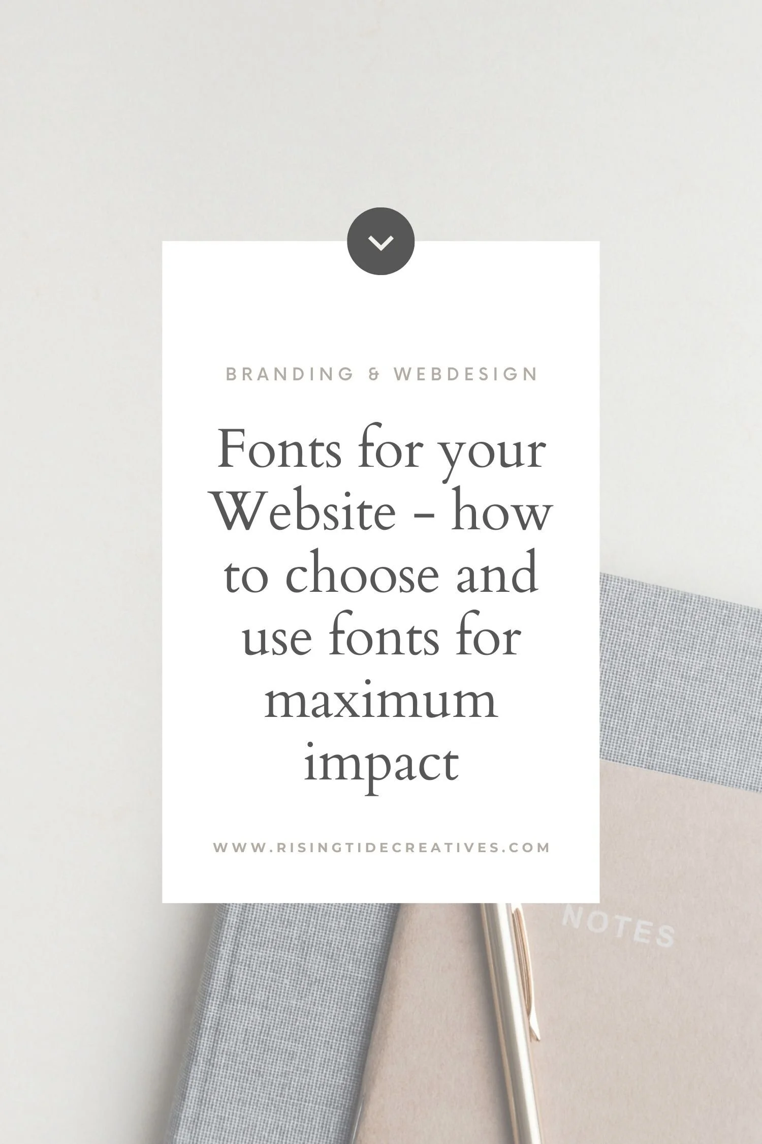
Fonts for Website - how to choose and use fonts for maximum impact
Today’s guest blog covers everything you need to know about choosing and using fonts for your website. Our guest blogger is an incredible designer and small business owner, not to mention formally trained graphic designer. I’ll hand it over to her to introduce herself… enjoy!

Hey, my name is Amy and I’m a branding designer behind the business Begin Studio! A full-service branding studio offering brand, packaging and website design packages. I’m so happy to be guest featured on this blog and thanks so much to Helen for asking me to be here!
So, without further ado - here we go. The big question - choosing fonts for your website.
Typography 101: The basics of fonts
Different types of fonts
Before we jump into what you need to consider and how to place your fonts, let’s first get into the basics. You have a few different types of font, but the core three font types are Serif, Sans Serif and Script.
Serif can be defined by its small lines attached to the end of strokes in each letter. Two fonts from this category are Times New Roman and Didot. These fonts generally, but not always, find their place among more premium brands as they are seen as more classic.
Sans Serif can be defined as a font, without these lines, hence the name ‘Sans’. Two fonts from this category are Lato and Roboto. These fonts generally, but again not always, find their place among more approachable and relatable brands. There are some exceptions such as Optima - Optima has very delicate line widths so usually is described as premium and classic.
Script fonts are really easy to spot, they are usually designed to look like handwriting and can be very fluid. Two from this category are Miya and Pinyon Script. These fonts generally get a bit of a bad rep for being childish with some looking like an Edwardian love note and some looking more sinister. But with the rise of Creative Market, more and more beautiful, classy script fonts are being designed every day and using these in a small way can add a lovely pop of personality to a website.

Different ways to style a website font
Styling a font is a great way to add a little extra something or create emphasis when you most need it. There’s four classic ways to work a font!

Bold font
Bold can be used to add emphasis to a sales message or draw attention to a button, when used wisely it can be a really powerful tool.
Italic font
Italics can be used to show enthusiasm and warmth, they also work really well if you have a direct quote.
Letter Spacing
This is the space in between the individual letters, also referred to as tracking. Tracking is really impactful, especially if used in conjunction with all caps letters. I love using wide tracking on my buttons so each letter is really easy to read and clear. (visual)
Line Height
This is the space between each line of text, also referred to as line height. While most fonts have their own line widths that are usually perfect, you can also add some more space into your line-height to create space and make this text easier to read. Or you can remove space to make the text tighter and more urgent. These options could be really impactful for titles and subheaders, but for smaller paragraphs, be mindful of changing your line-height as it can really impact the length of your pages and how easily your text can be read.
Text Transform
This option means you can use uppercase, lowercase and capitalise (capitalise only on the first letter of each word) to style your fonts rather than manually applying caps to your text. These changes will apply to this font throughout your site.
Different Font Weights

This option is similar to Bold, you can add thicker or thinner styles of your fonts. This can be really impactful if you want your Titles to be a little bolder to stand out - or if you want to make some subtitles thinner so that they are more blended in.
PRO TIP - Letter spacing, line height, text transformation and weights can be amended in your Squarespace font settings but you can add Bold and Italic to any font on your website.
How to choose and pair your website fonts perfectly
Choosing website fonts based on your business
Choosing fonts reflective of your brand and what your business is all about is really important. When picking a font, I recommend asking yourself the following questions and writing a list of adjectives to help you see your business in words, and give yourself a strong foundation to build your website.
What words would you use to describe your business?
These could be anything such as fun, playful, elegant, premium, bold, refined, fast-paced, approachable, secret, exclusive...
Do you have any brand values or ways that you run your business that we could draw inspiration from? This could be environmental, friendly, personal or it could be effective or persuasive.
Who is the target audience that this website is for? Writing down who your website is for is a really great way to start thinking about what they would like to see in order to connect with your website. For example, you might find a classic Serif font that looks really great but if you’re a fun, friendly children’s wear company - the chances are you might want to be more soft and approachable so reaching for a Sans Serif might be a better choice.
If you have a logo and brand, do you have fonts there you can use as a base? If you do have a brand and logo in place, it’s really important to ensure your website matches and compliments your brand rather than work against it. This is a similar tactic to the big companies with huge marketing teams, such as Coca-Cola, by ensuring you use similar colours and fonts on your website to your logo you can create consistency and brand familiarity which helps buyers buy!
To give another example, if you are making a website to promote a high-end fine-dining restaurant, the chances are that picking a fun, friendly sans serif wouldn’t represent your brand values of ‘classic’ and ‘premium’ - so reaching for a Serif would be a better choice. If you’re looking for a guide to choosing your brand colours too, there is one over on the Begin Studio Website, and a blog about Website Colours for Squarespace Websites here too!
But really… the secret to defining the feel of your business & therefore brand lies in being clear on your ideal client!
Luckily for you I’ve created a free workbook helping you do just that, making a tricky process step by step simple with a fill in the blanks approach saving you a tonne of time n head scratching… grab it below!
20 examples of website fonts chosen based on business
To help guide you through assigning fonts to your brand values - I’ve created this little graphic to show some directions you could go depending on your brand values. The core ideas here are to use your brand values to help guide you in a direction. But remember that you don’t have to be literal with your font choices, if you are doing a website for a conference on Egyptian History - you do not have to choose an Egyptian font - you could pick a modern font that matches the professional tone of your conference!

Pairing fonts together for your website
Typography pairing has hundreds of rules, and the details behind why some fonts work well together and some do not can be a little tricky. It mainly comes down to the characteristics of the fonts, readability and whether they balance each other.
The most popular pairing that I see as a designer is Serif and Sans Serif together. I would say I see this 90% of the time! You can choose to have a Serif font as your title font, and then a Sans Serif for your paragraph. This is great as Serif’s make great titles and sans serif fonts are really easy to read so make really great paragraphs.
Or you can choose to have it the other way around if you want your site to be more casual but still ensure the body copy is visibly different and legible.
However it doesn’t have to be as black and white, you could also have all Sans Serif fonts, but use different typefaces and weights to create a balance. As long as there’s balance, the fonts match your brand and your buttons stand out - you’ll be on the right track.
Ground rules to keep in mind when choosing your fonts.
Your Heading Fonts (H1, H2), should be noticeably different to your body copy so they are captivating to read and stand out
Don’t use all the same font for everything - it might seem like the easy choice but it works against you as there is less differentiation and less hierarchy in your layout.
If you pick a font that is very bold and decorative, try to pair it with a simpler font so your layout isn’t too busy and distracting.
Put your button text in all caps with lots of spacing - it’s a tradition as old as the internet itself, but it really works to grab the attention of a viewer and make your intention really clear. Because it is also a pattern that is seen everywhere, most people come to expect it which can work in your favour.

How to choose fonts to make your website buttons impactful
One mistake I often see on websites is using thin or hard to read typography on buttons. Your buttons are one of the most important elements of a website as they guide your viewers through your website into contacting you or purchasing from you. So use something that’s bold and easy to read. My recommendation is to use a clear all-in-caps Sans Serif with a good amount of letter spacing.

Placing your fonts into Squarespace
Now you have your fonts planned out - let’s get them into Squarespace!
You have a few font opportunities within the Squarespace templates which vary slightly depending on the type of website you have. These can be broken down into your Headings, your Subtitles and your buttons. Remember to use different fonts for both your heading and your paragraphs to help keep your text easy to read! You can also head over to Squarespace for guidance and support from their team.
Setting fonts on 7.1 Squarespace templates
One font for your headings and subtitles (H1, H2, H3, H4) that can be different sizes.
One font for your paragraphs (P1, P2, P3)
One font choice for your buttons.
And lastly, one font choice for something called ‘miscellaneous’.
Most of these are fairly straightforward, but the Miscellaneous category applies to text like product prices, navigation, and information around your content. So this text is used for important pieces of information so needs to be clear and easy to read.
Setting fonts 7.0 Squarespace templates
7.0 is a little more old-school, so has access to less sizes. Here you place one font and size into the following categories:
Your large Heading (H1)
Your Subtitle (H2)A smaller title (H3)
Your Body copy or Paragraph Text (P1)
Then your Buttons with (Three sizes)
On 7.0, you can also make choices for the fonts on your blogs, image titles and product descriptions but it’s best to keep these to be one of the fonts you choose from your headings or body copy.
Need a spot of help?
My FREE Squarespace template for service businesses, not only gives you a structure based on sound best practices, and a heap of Squarespace how-to videos, it also gives you a 6 month free trial on Squarespace, as opposed to the two weeks you normally get, giving you as much time as your little heart desires to play around with fonts!
Get your FREE Squarespace template (and 6 month free trial) plus 20% off your first year’s subscription on Squarespace, when you grab it!
So there you have it!
Now you can have an insight into what is the best fit for your brand and you know the basics of choosing fonts that are ready for your site, you can move ahead and refine the typography for your site! If you have any design questions or want to pick my brain on branding then feel free to head over to Begin Studio’s site or you can reach out to me on Instagram!
Thanks so much again for having me Helen it’s been really fun! Amy
Thanks Amy for breaking down what can be a daunting topic into such an easy to digest guide on all things website fonts! I’m sure you’ll see Amy again on the blog - but until then, go and give her a visit at Begin Studio - you’ll even see a little guest blog from me over there!
Helen
More on branding & design to get you noticed online


New on the ‘Gram…